
Choosing the perfect color for your space can feel overwhelming, with countless options and nuances to consider.
Two key questions often arise in this process: what is the most stressful color? What colors can trigger anxiety? Color psychologists agree that red tops the list as the most anxiety-inducing hue.
Red can be quite overpowering—could your red decor be why some visitors feel uneasy in your home? This color often symbolizes danger and can evoke anger. Its strong, aggressive nature is why it appears in warning signs and traffic lights. Physiologically, red can spark reactions similar to stress responses, such as a quickened heart rate and elevated body temperature.
Yet, red isn't solely negative. When used thoughtfully as an accent, it carries positive meanings, symbolizing love, power, and motivation. This striking hue not only captures attention but can also ignite passion and enhance memory retention.
Experts in color psychology and design share insights on why red is considered the most stressful color and offer tips on how to incorporate it into your decor in a way that feels comfortable. Utilizing the color wheel, you can create harmonious combinations that feature red without overwhelming your space.
Understanding the Stressful Nature of Red
Despite its negative connotations, red is a significant color that influences our mindset and decorating choices. Historically, evidence suggests that over 40,000 years ago, early humans utilized red clay for body and wall paint, sometimes for protective rituals in the afterlife.
Today, research emphasizes the crucial role shades of red play in our early development. Remarkably, red is among the first colors we perceive after black and white.
Red has also been a prominent feature at weddings, from ancient Roman brides in red shawls to modern-day Chinese weddings, where red signifies good fortune.
Over the years, color psychologists have recognized that red significantly impacts our emotions, perceptions, and actions. Incorporating red into your decor can even influence physiological responses. What is it about crimson, scarlet, and ruby that makes them such potent choices in interior design?
While red has immense design potential, it's often viewed as the most stressful color. According to Karen Haller, a specialist in color psychology, "It's a color that we struggle to live with in large amounts."
"The most stressful color can vary personally; it may remind someone of a negative experience. While red tends to elicit a physical response—like an increased heart rate—its impact can be deeper than that," she adds.
"Being aware of how color can influence our mindset is crucial. For children's bedrooms, I'd recommend avoiding red; it can energize them instead of promoting sleep," Haller advises.
However, red can still work beautifully in your decor. It's a captivating and impactful shade when used wisely. We consulted several interior designers for their best advice on how to incorporate this bold color effectively.
Incorporating Red into Your Home
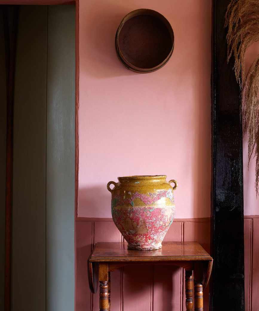
Soft earthy pinks—these natural tones, blending red, pink, and brown, bring warmth reminiscent of summer sunsets.
1. Embrace Earthy Rhubarb
To soften the intensity, consider using it on the walls while painting trim in fresh white, as demonstrated in this design by Georgie Wykeham. Toned-down earthy shades create a relaxing ambiance.
"Rhubarb is my favorite choice; it adds warmth and depth to neutral schemes," notes Georgie Wykeham, founder of Georgie Wykeham Designs. "On its own, it's easy to live with and complements blues, greens, and pinks beautifully."
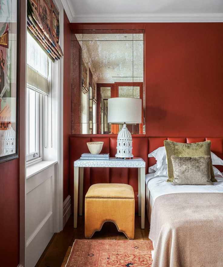
2. Add Depth and Light
"When colors blur between shades, they can create intrigue," explains Edward Bulmer, founder of Edward Bulmer Natural Paint. "Our Etruscan Brown draws inspiration from both the red of Etruscan frescoes and classic earth tones, providing a rich yet neutral appeal in the right lighting."
This sophisticated tone offers depth without being overwhelming. If it feels too bold, try it in smaller areas for a surprising touch.
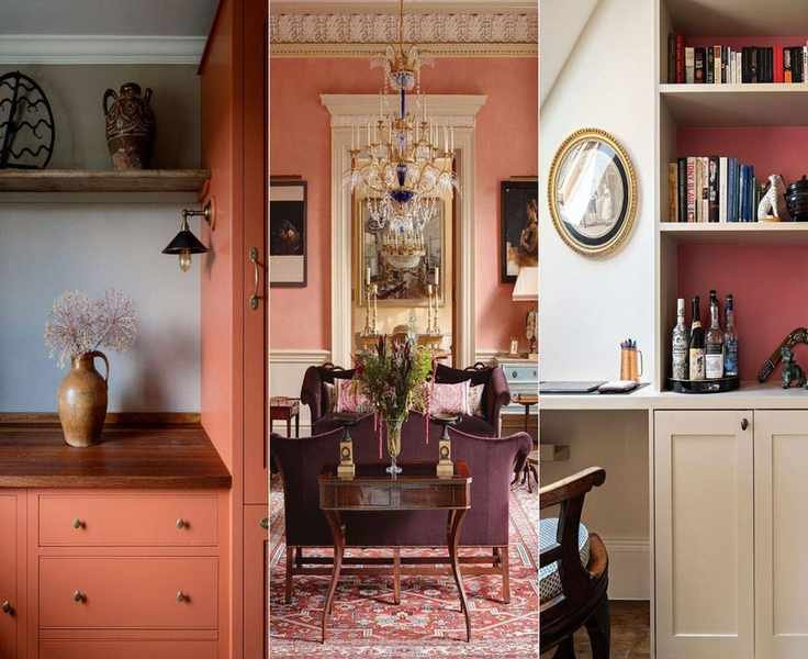
3. Create a Distinctive Touch
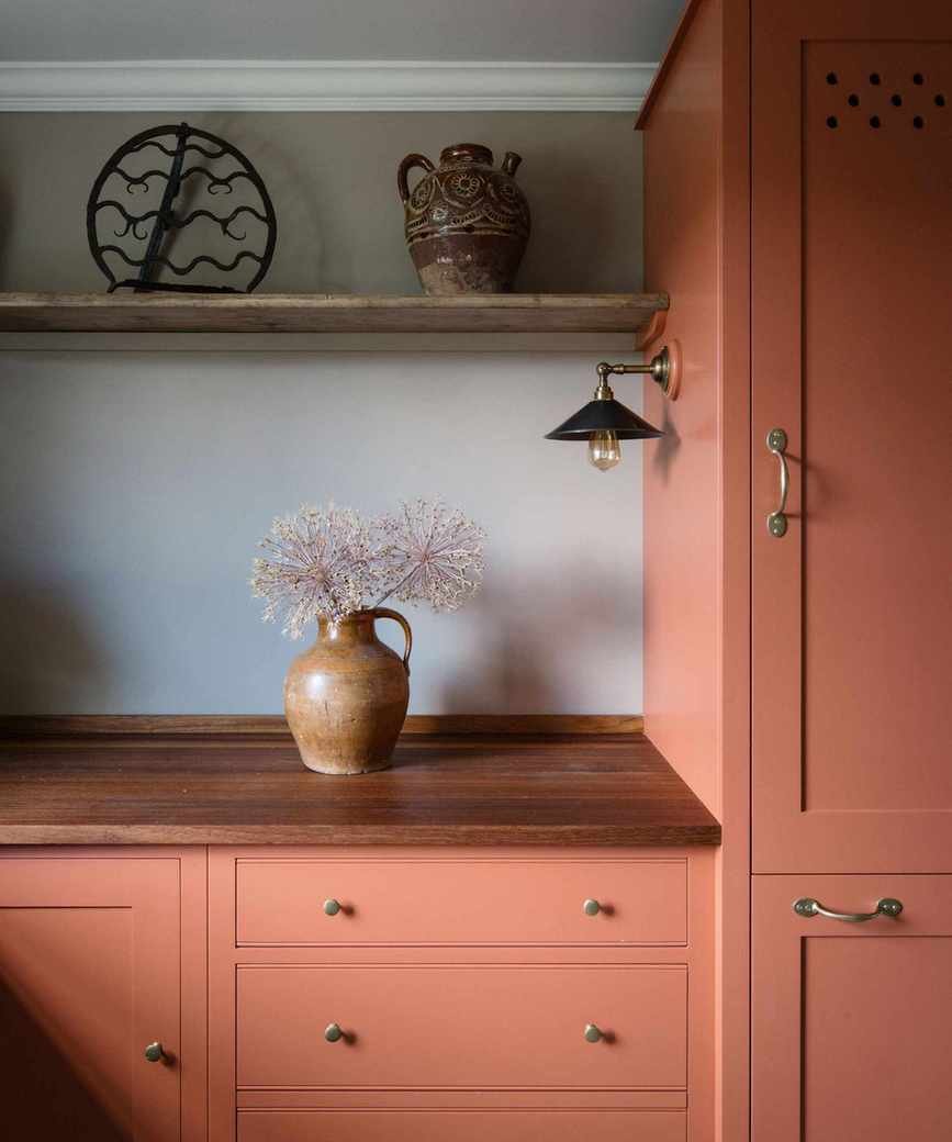
Max Rollitt showcases his unique design style in a Georgian rectory, where warm-colored kitchen cabinets provide a perfect backdrop for antique decor.
"These pinks bring warmth to darker rooms year-round," says Max Rollitt, founder of Max Rollitt. Be bold with your color pairings when using red; it can create striking combinations. Recently, I paired an earthy pink in a bathroom with a complementary cornflower blue."
4. Use Red-Pink as an Art Canvas
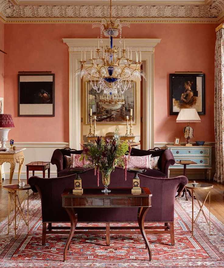
This elegant hue serves as a stunning backdrop for portraits by artist Diarmuid Kelly, enhancing the architectural details in this drawing room by Studio Indigo.
"Pink is my preferred color for art settings," states Mike Fisher, creative director at Studio Indigo. "When layered with multiple coats, it creates depth and movement, especially in sunlit rooms, making the space feel vibrant and dynamic."


