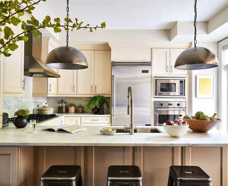
Classic, elegant, and incredibly adaptable, cream remains a top choice in interior design. Its versatility allows it to harmonize with a wide range of accent colors, from soft neutrals like beige to vibrant hues and deeper shades like gray and blue.
If you're thinking about using cream in your home, understanding which colors work best with this beloved neutral is essential.
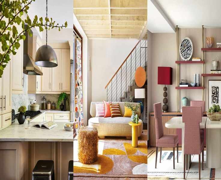
8 perfect colors to pair with cream
Calm and versatile, cream creates a serene atmosphere and can enhance vibrancy in any room. It pairs beautifully with subtle tones such as tan and taupe while serving as an ideal background for brighter accents and textures. Interior designer Naomi Astley Clarke notes that cream brings an organic, grounded feel to spaces.
To elevate a soothing cream palette, consider these eight accent colors.

With over 20 years in interior design, Naomi has worked with a diverse clientele, creating inspiring renovations for homes and businesses alike.
1. Another neutral shade
For a tranquil space that embodies a grounded vibe, pair cream with another neutral. Sherwin-Williams' color expert Sue Wadden suggests that using a beige like Touch of Sand alongside cream creates a calming atmosphere.
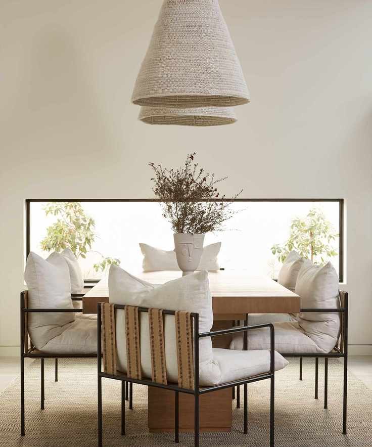
This cozy cream dining area, designed by Lucie Ayres of 22 Interiors, showcases a minimalist aesthetic with warm wood tones providing a soft contrast against cream walls.
2. A stunning blue
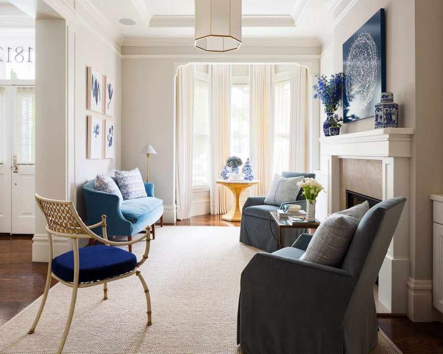
Explore the color wheel to find complementary shades; blue sits opposite cream. Helen Shaw, color expert at Benjamin Moore, notes that this combination adds sophistication, ideal for kitchens or thoughtful spaces like home offices.
In a recent design by Margaret Ash Design, creamy walls and soft rugs enhance the vibrant blue upholstery, creating a focal point in the room.
3. Embrace lush green
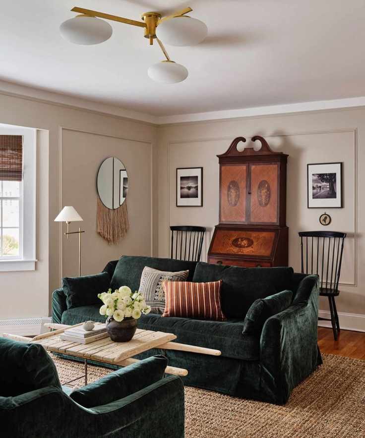
Green remains a top choice in home decor, promoting a seamless indoor-outdoor connection. According to Patrick O'Donnell from Farrow & Ball, pairing cream with sage greens like French Gray can create a modern palette.
In this living room by Ryann Swan Design, a lush green velvet sofa contrasts beautifully against the warm neutral tones.
4. Bright and warm tones
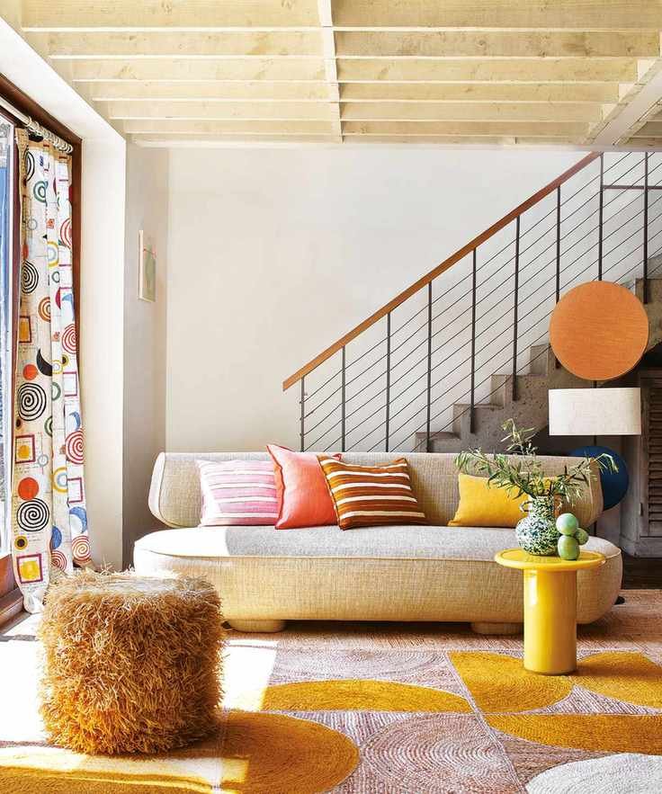
Warm shades like Reynard blend wonderfully with cream, creating a cozy space. NYC designer Artem Kropovinsky suggests bright coral or sunny yellow for an inviting atmosphere.
5. A rich red
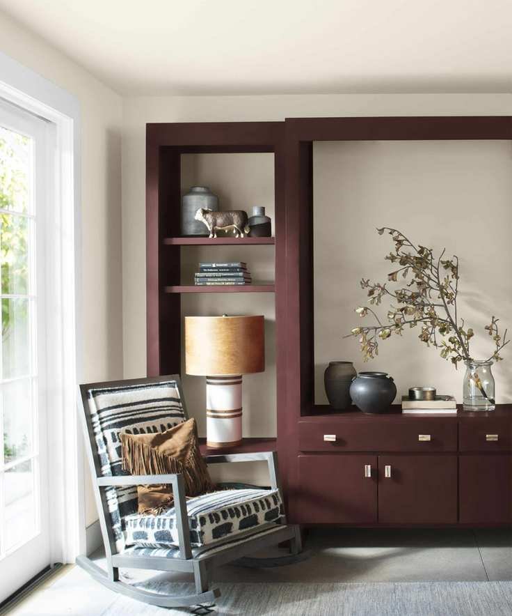
Cream's warm undertones pair well with earthy reds like burgundy. Interior designer Audrey Scheck recommends deep reds for a refined look alongside calming cream.
6. Soft pink
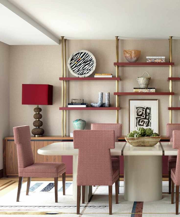
Pink shades complement cream beautifully, adding warmth. Audrey Scheck advises that maintaining consistent undertones in your palette creates cohesion.
7. Classic black or gray
Cream balances dark shades like black and gray effectively. In a contemporary kitchen by J Patryce Design, cream cabinetry pairs elegantly with dark accents, ensuring warmth and style.
8. Layer cream with cream
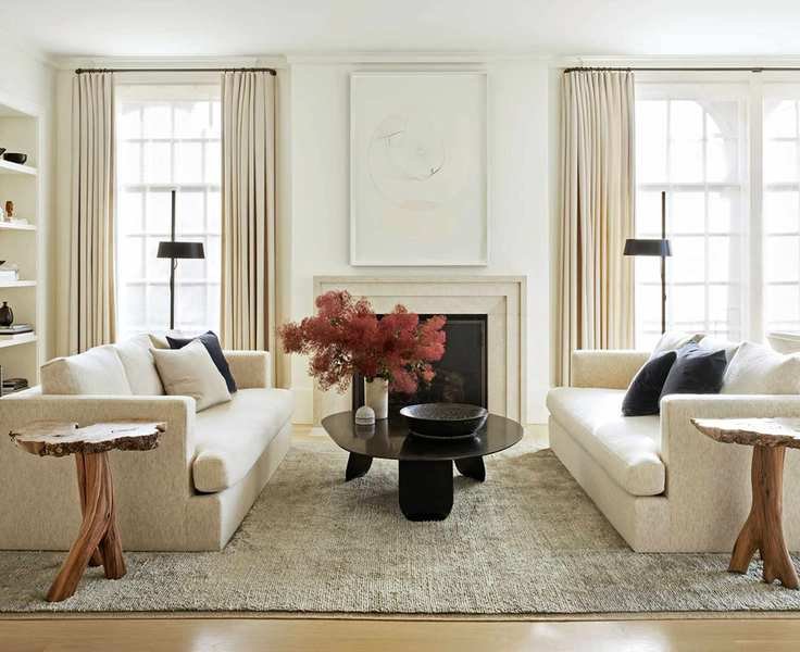
If you love cream, combining different shades can create a peaceful retreat. Patrick O'Donnell suggests using two creams, like a softer wall shade paired with a stronger trim for a balanced look.
FAQs
Do gray and white pair well with cream?
A gray, white, and cream palette fosters a serene, timeless environment. Light or dark gray contrasts elegantly with brighter neutrals.
As Patrick O'Donnell explains, cream can soften spaces while providing a gentle warmth.