
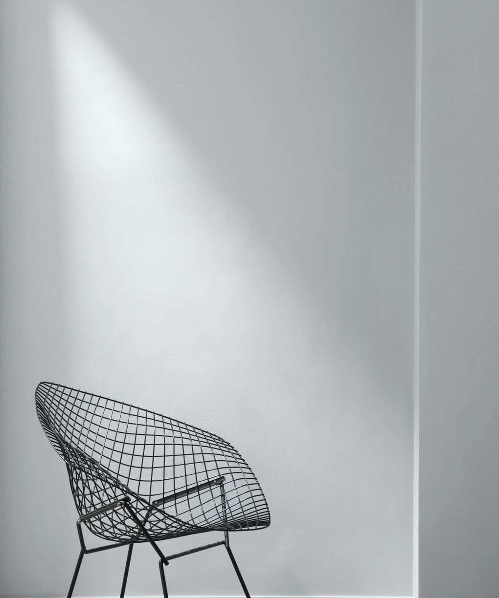
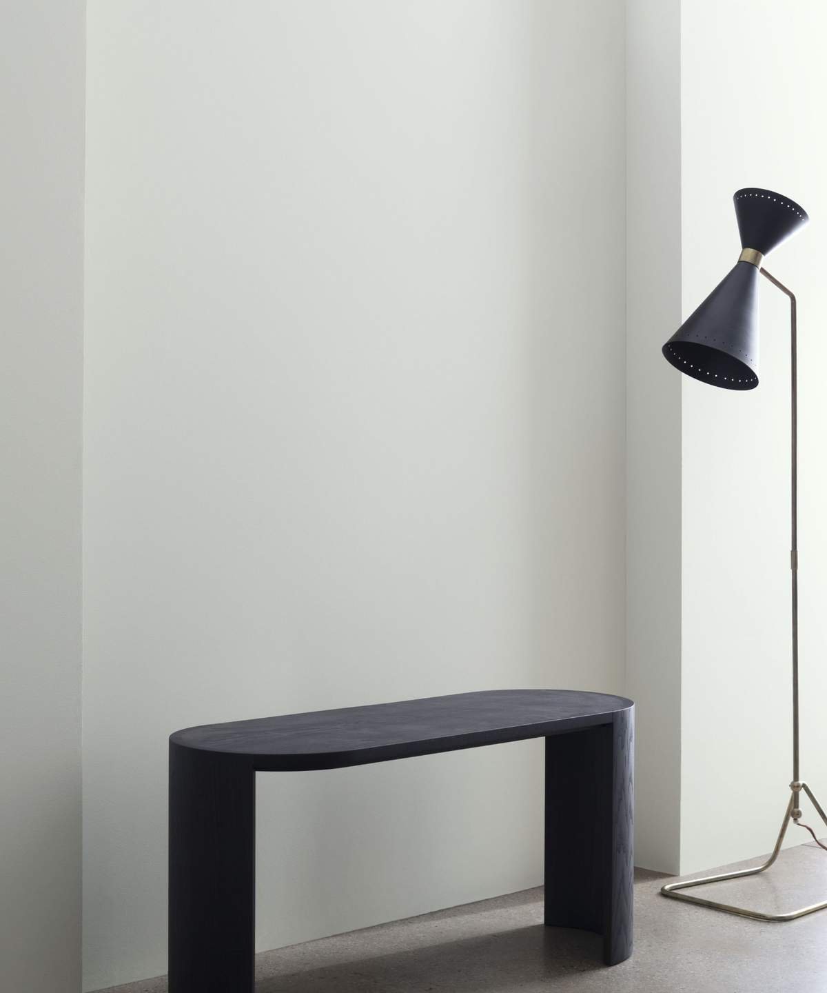
Choosing paint colors that blend blue and gray is a classic choice for achieving a refined and effortlessly stylish interior. Leah Harmatz, the Founder of Field Theory Interior Design, notes that 'Blue-gray tones have an inherently peaceful quality, making a room feel spacious and welcoming. These tones are reminiscent of many elements found in nature, so they impart that sense of calm to a space.'
If you're eager to decorate with blue paint but worried about introducing a stark chill into your space, Benjamin Moore has unveiled its favorite blue-gray shades that feel airy and refreshing without being overly frosty or harsh.
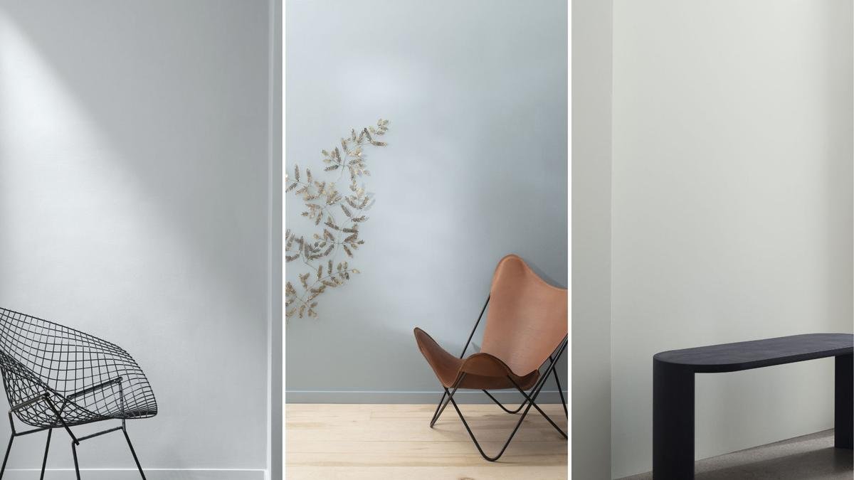
Let's take a closer look at four standout paint colors and how to incorporate them beautifully into your home.
A post shared by Benjamin Moore (@benjaminmoore)
A photo posted by on
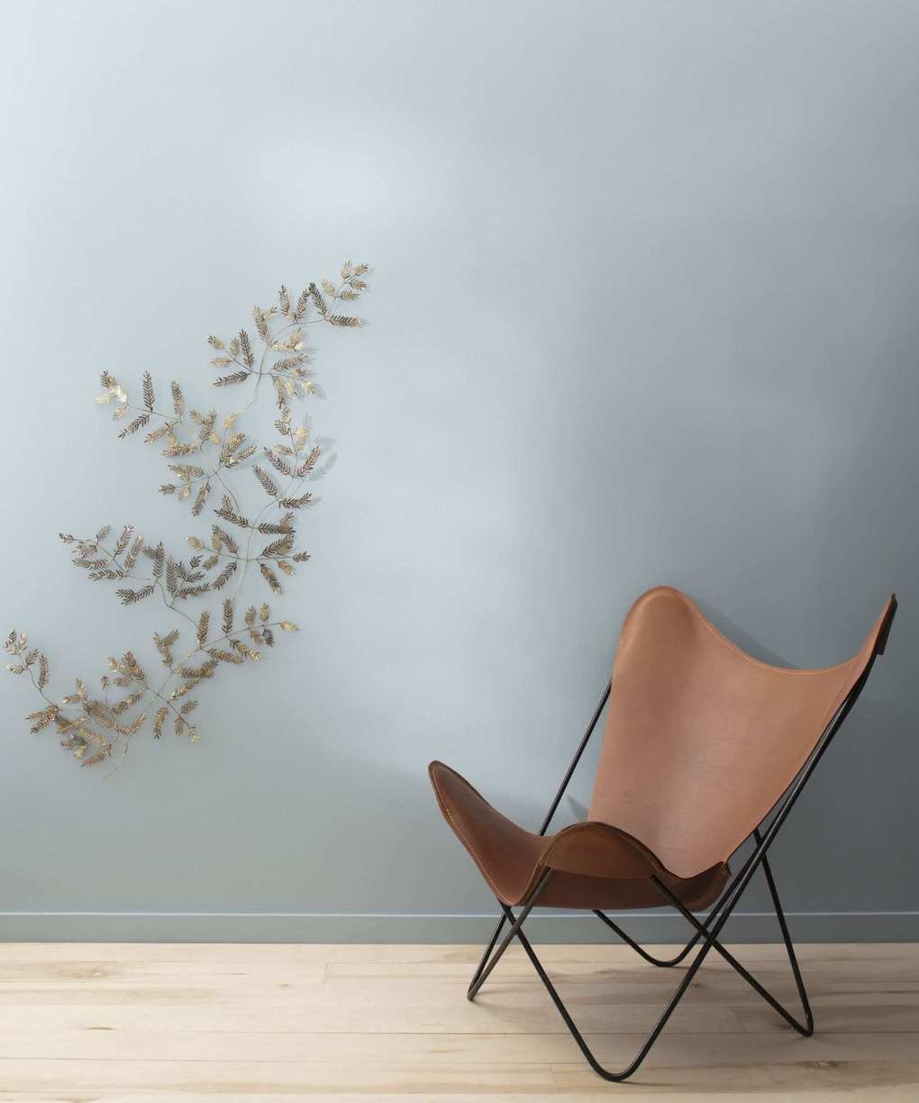
Silvery Blue 1647 – A Gentle and Serene Hue
Silvery Blue 1647 is a whisper-soft blue with a subtle gray undertone that breathes freshness into any room. It's an excellent choice for spaces like bedrooms, bathrooms, or living areas where you want a touch of delicate color without overwhelming the overall aesthetic.
To create a soft, layered appearance, pair this color with a bright white such as Chantilly Lace OC-65 or light neutrals like Classic Gray OC-23. If you're aiming for a coastal vibe, think about combining it with natural materials like rattan, linen, and weathered wood.
Arianna Barone, Color Marketing Manager at Benjamin Moore, describes this shade as 'an easy, breezy blue with a soft hint of gray that adds versatility. It can mimic clear skies and calming waters without being overly pastel. Consider using it on ceilings for a playful touch to that sometimes-overlooked fifth wall. I also love it in bedrooms and bathrooms for a light, airy feel.'
Silver Mist 1619 – A Calming Blue with Subtle Gray Depth
Silver Mist 1619 is a chic blue-gray that beautifully adapts to various lighting conditions. During the day, it presents a misty, cool blue, transitioning to a soft, neutral gray by evening, making it ideal for areas with abundant natural light or those that lack it.
This color pairs flawlessly with warm whites like Swiss Coffee OC-45 and Pale Oak OC-20, creating a serene, nature-inspired ambiance. Arianna states, 'I love using it in spaces with limited natural light to enhance the sense of openness. Paint it on walls, trim, and ceilings to establish a rejuvenating oasis.'
Bunny Gray 2124-50 – A Soft Gray with a Hint of Blue
For those seeking a soft and airy tone with a touch of blue, Bunny Gray 2124-50 is an excellent option. Its gentle softness ensures it doesn't feel too cold, making it perfect for nurseries, guest rooms, and airy living spaces.
For timeless decorating, consider highlighting your baseboards and trims with warm whites like Cloud White OC-130 or deeper blue-grays such as November Skies 2128-50. To achieve a sophisticated monochromatic look, think about painting both the walls and ceiling in Bunny Gray for a seamless, cocooning effect.
This shade comes highly recommended by Arianna, who shares, 'This is one of my favorite blue-grays to suggest for any space. It works particularly well in rooms with abundant warm lighting, balancing out the sunlight that often floods southern-facing rooms.'
Wickham Gray HC-171 – A Timeless Favorite
A standout shade from Benjamin Moore's historical collection, Wickham Gray HC-171 is a sophisticated gray with a subtle blue undertone. It pairs beautifully with bright trim in Decorator's White OC-149 for a crisp contrast, or introduce soft blues like Smoke 2122-40 for a more tranquil, tonal effect.
Wickham Gray shines in open-plan areas, such as kitchens and sunrooms, reflecting light gracefully throughout the day. 'The grayest of these four options, this essential blue-gray has endless versatility,' explains Arianna. 'When you're searching for a cool, refreshing neutral, this is always a fantastic color to try. I love using it in transitional spaces like living rooms, hallways, and kitchens because it serves as a great palette staple that offers numerous possibilities for adjoining areas.'
Blue-gray paints possess a timeless charm, striking a perfect balance between color and neutrality. Whether you're drawn to the subtle coolness of Silvery Blue or the refined softness of Wickham Gray, these shades provide a light, airy, and welcoming environment in any room.


