
In recent years, gray hasn't always been the star of interior design, overshadowed by warmer colors and vibrant shades. However, its enduring appeal is evident, particularly through popular options like Revere Pewter by Benjamin Moore, which remains a favorite among designers.
Revere Pewter stands out as a warm gray, suggesting that cooler gray tones may be fading from the current design trends. This shade is often praised for its ability to act as a "versatile bridge between warm and cool tones," making it an adaptable choice for various styles.
What Makes Revere Pewter Special?
Revere Pewter is considered a classic neutral that harmonizes well with both warm and cool colors. It brings a contemporary feel while adding warmth to otherwise stark designs. This shade’s flexibility allows it to complement a wide range of design styles and accent colors, making it an ideal foundational color for any decor, as noted by color expert Helen Shaw.
Essentially a griege, Revere Pewter leans slightly more towards gray than beige, making it an excellent backdrop that pairs beautifully with many other colors.

Helen Shaw is a color expert and has played a significant role in marketing strategies at Benjamin Moore.
Decorating Tips with Revere Pewter
Decorating with Revere Pewter is a breeze thanks to its warm nature and compatibility with cooler tones. This paint color offers endless possibilities for layering and pairing with other soft neutrals or grounding it with deeper shades. Interior designers appreciate this shade for its warmth and versatility.
1. Create a Tonal Look with Neutrals and Textures
This greige serves as a fantastic base for a sophisticated tonal neutral palette. Combine it with whites for a fresh feel, and use beige tones to soften the look, incorporating various textures to introduce depth and interest.
“Revere Pewter, with its warm undertones, provides an excellent foundation for any decor,” suggests designer Jennifer Davis. “To maximize its versatility, combine it with lighter neutrals like soft whites or light grays, either by painting an accent wall or enveloping the entire room. Mixing materials and layering textiles can add inviting warmth and depth.”
“In line with the moody design trend, we've been using it as the trim color against warm Alabaster walls. When paired with Alabaster, Revere Pewter enhances the contrast of wood-toned furniture and natural brass accents, providing a canvas that adapts to various styles in both bedrooms and living rooms,” she continues.

With over 25 years in the design industry, Jennifer Davis has a knack for creating timeless designs while ensuring a delightful client experience.
2. Introduce Darker Hues for Contrast
“When using Revere Pewter, contrast is crucial,” Jennifer advises. “Incorporate darker colors like navy blue, charcoal, or deep green through accessories such as pillows, rugs, or standout furniture pieces to add visual intrigue against the Revere Pewter backdrop.”
Helen agrees that this gray paint complements darker shades well, emphasizing the importance of matching undertones. “Pair with colors that share similar undertones for a balanced aesthetic. For instance, a pale pink can create a chic Scandinavian-inspired interior.”
“A lovely combination is dark chocolate brown with red undertones alongside this greige, creating a soothing and restful environment. Remember that Revere Pewter’s appearance can change under different lights, so always test it in your space before making a final decision,” Helen adds.
3. Use in Any Room, Regardless of Size
As previously mentioned, Revere Pewter is quite adaptable, appearing differently in various lighting conditions — it can shift from a dark greige to a lighter beige. This chameleon-like quality enhances its versatility.
“One of Benjamin Moore's most adaptable colors, Revere Pewter balances warm and cool tones in any room, making it suitable for diverse applications and lighting scenarios,” says Jennifer Walters, founder of Folding Chair Design.
Jennifer Davis adds, “Lighting significantly impacts how Revere Pewter is perceived. Natural light can highlight its warmth, while artificial lighting can emphasize its gray tones. Always test paint samples in your specific lighting conditions to ensure the color resonates well within your space.”
4. Ideal for Kitchen Cabinets
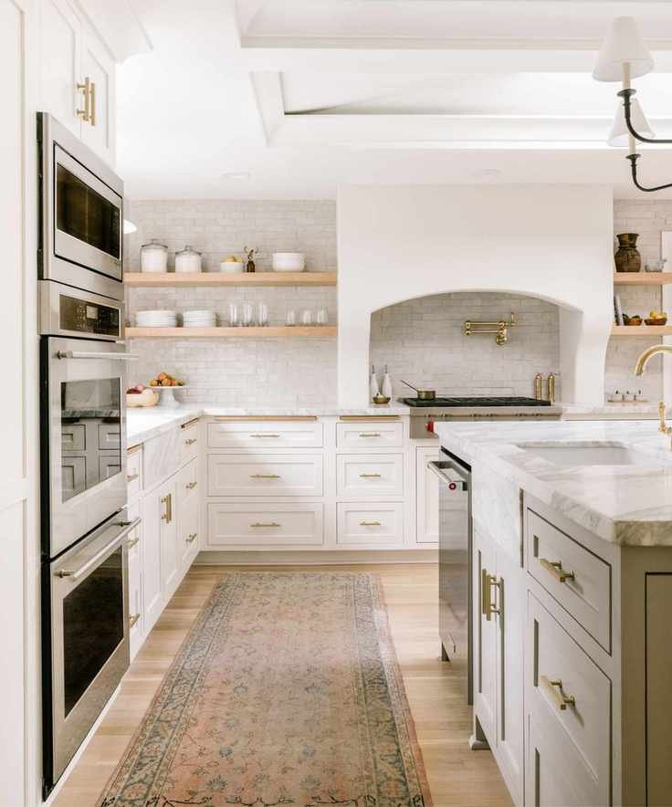
Gray kitchens may not dominate current trends, but they remain a classic choice. The key is selecting a warmer gray, as cooler, steely grays can date a kitchen's look. Revere Pewter strikes the perfect balance, making it adaptable to changing design trends and compatible with most colors and styles.
This kitchen, designed by Jessica Nelson, features Revere Pewter on the kitchen island with a fresher white on the remaining cabinets. The contrast of the darker island against the white cabinetry creates a harmonious look without overwhelming contrast.
5. Harmonize Warm and Cool Colors

Finding a color that pairs well with both warm and cool shades is rare, but Revere Pewter excels in this regard, making it an excellent backdrop for blending both sides of the color spectrum. Its gray tones allow for combinations with cooler grays and blues, while its beige undertones harmonize with warmer earth tones.
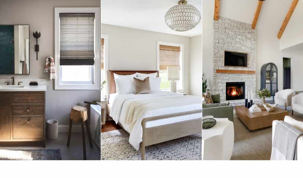
In this neutral bedroom by Kathy Kuo, the subtle color palette features ashy grays meeting warm woods and soft creams for a perfectly balanced look.
Kathy shares her fondness for this versatile paint: “Revere Pewter features undertones of warm beige and cooler green, making it the ultimate connector between warm and cool color families. It’s easy to pair with various decor styles and contrasting colors.”

Kathy Kuo is a renowned interior designer with over two decades of experience in the home and lifestyle industry.
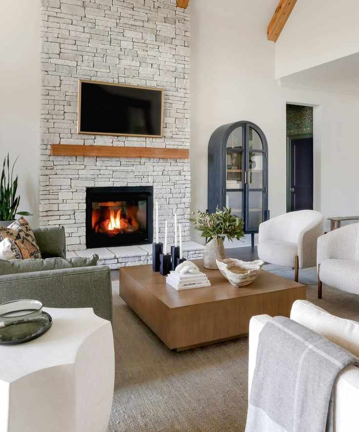
6. The Perfect Backdrop for Bold Colors
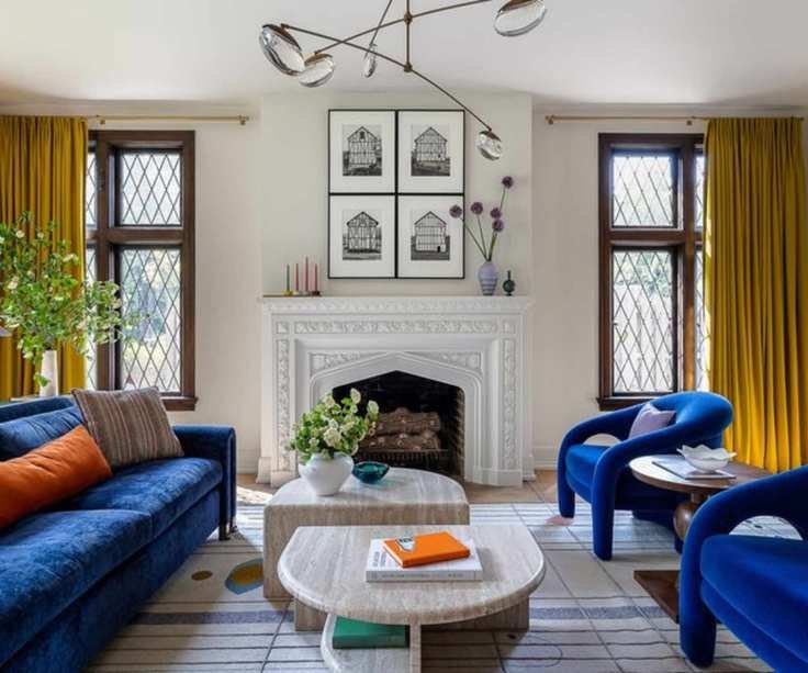
While we’ve explored many neutral spaces, Revere Pewter also serves as an excellent backdrop for bolder colors. This living room, designed by Bethany Adams, showcases beige walls paired with vibrant primary colors. The softness of the beige beautifully balances the bright hues, resulting in a space that feels both lively and welcoming.
“Revere Pewter has been one of my go-to colors for over ten years. I particularly love it for trim or cabinetry as it adapts to warmer or cooler tones based on what it’s paired with,” Bethany explains. “It always looks chic, timeless, and fitting — I’ve never seen it look anything less than stunning.”
It's clear why Revere Pewter remains a bestseller—its classic appeal, versatility, and compatibility with any style make it a winning choice. Just keep in mind how this shade can transform under different lighting conditions; every version is stylish, but testing a sample in your home is essential to see how it adapts to your unique space.


