
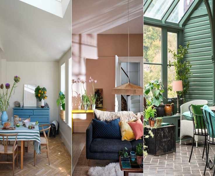
Farrow & Ball presents a stunning array of iconic paint colors that have captured the hearts of homeowners and designers. Renowned for their rich pigments and captivating shades, these paints are a staple in the interior design realm.
With a selection ranging from soothing, earthy neutrals to deep, moody shades of blue and green, you'll likely recognize many of their most beloved hues for your home decor.
'The key to using color is crafting spaces that feel warm and inviting for our loved ones – hues that instill pride in our homes,' says Joa Studholme, Farrow & Ball's Color Curator.
10 Popular Paint Colors from Farrow & Ball
Here are ten paint ideas that stand out as favorites by Farrow & Ball. If you're seeking inspiration for colorful home makeovers in 2024, these shades offer both sophistication and versatility.
Every color, whether muted or bold, contributes to a warm and welcoming atmosphere.
1. Setting Plaster
Inspired by freshly plastered walls, Setting Plaster is a soft, earthy pink that has secured its spot as one of the brand's bestsellers for neutral decor.
'Gentle pinks like Setting Plaster are popular for every room; these shades have become the new neutrals, surpassing grays,' notes Charlotte Cosby, Creative Director at Farrow & Ball.
'Its subtle beauty envelops a space, creating a dreamy atmosphere, especially when applied to ceilings and woodwork.' For more, check out our pink room ideas.
2. Ammonite
Named after the cherished fossils along the Dorset coast, Ammonite is the brand's top neutral, balancing warmth and coolness. Its slight gray undertone becomes evident next to a brighter white like All White.
'Ammonite has an understated elegance,' Joa explains. 'Its soft gray tones offer a calming ambiance. It's perfect for woodwork and ceilings paired with darker walls.'
Ammonite suits both traditional and modern homes, which adds to its popularity. Farrow & Ball recommends using their 'white and light tones' primer for optimal results.

As Farrow & Ball's Color Curator and author of titles like Recipes for Decorating and How to Decorate, Joa is well-versed in Farrow & Ball's palettes and finishes. With over 25 years at the brand, she has developed color ranges and consulted on numerous design projects globally.
3. Railings

Railings, leaning more blue than black, offers a softer alternative to traditional black. This hue brings a dramatic flair to spaces, especially in studies and dining areas.
Joa emphasizes the versatility of Railings: 'Despite its deep shade, it can be used throughout the home on walls and woodwork. The blue undertones lend it a softer feel, making it a great accent for staircases and kitchen islands.'
This color can be beautifully paired with mid-toned woods, gray accents, and rich textures.
4. Down Pipe

Down Pipe is a deep lead gray with blue undertones, adding depth and complexity. 'Originally inspired by the color of downpipes, it's gained immense popularity for interiors,' say the brand's experts. It creates a striking contrast with lighter shades.
'Down Pipe is a go-to for accent walls and cozy sitting areas, offering a slightly gritty, industrial vibe without being overwhelming,' Joa notes.
Worried about it being too dark? Pair it with white woodwork and ceilings for a stunning contrast.
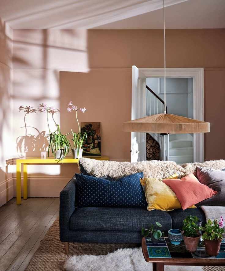
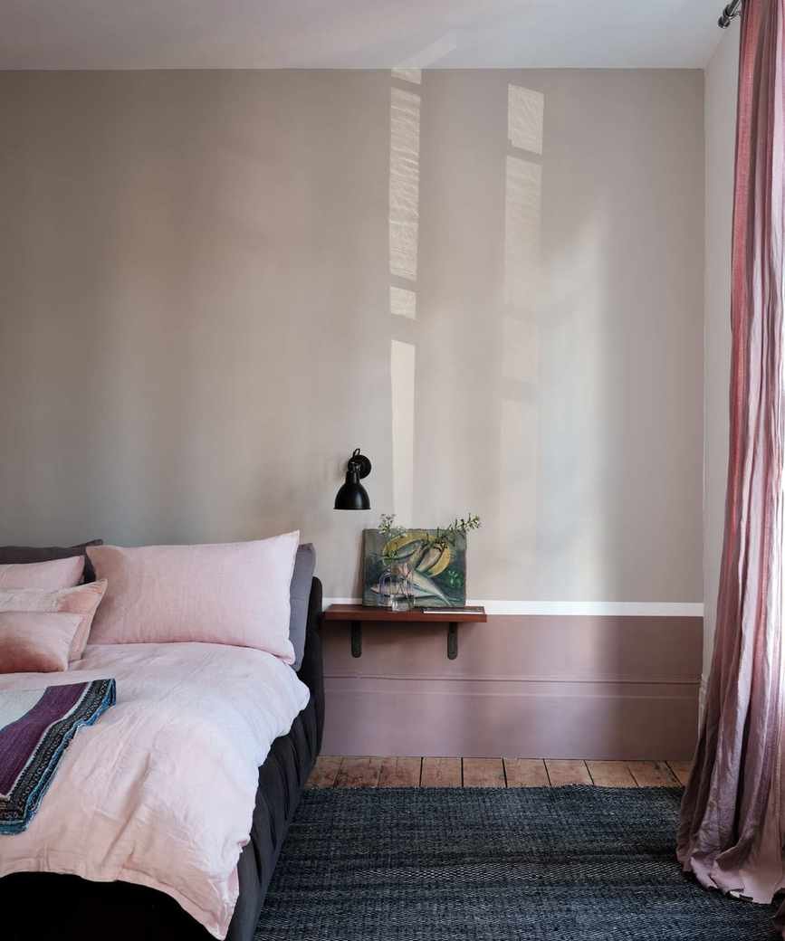
5. Sulking Room Pink
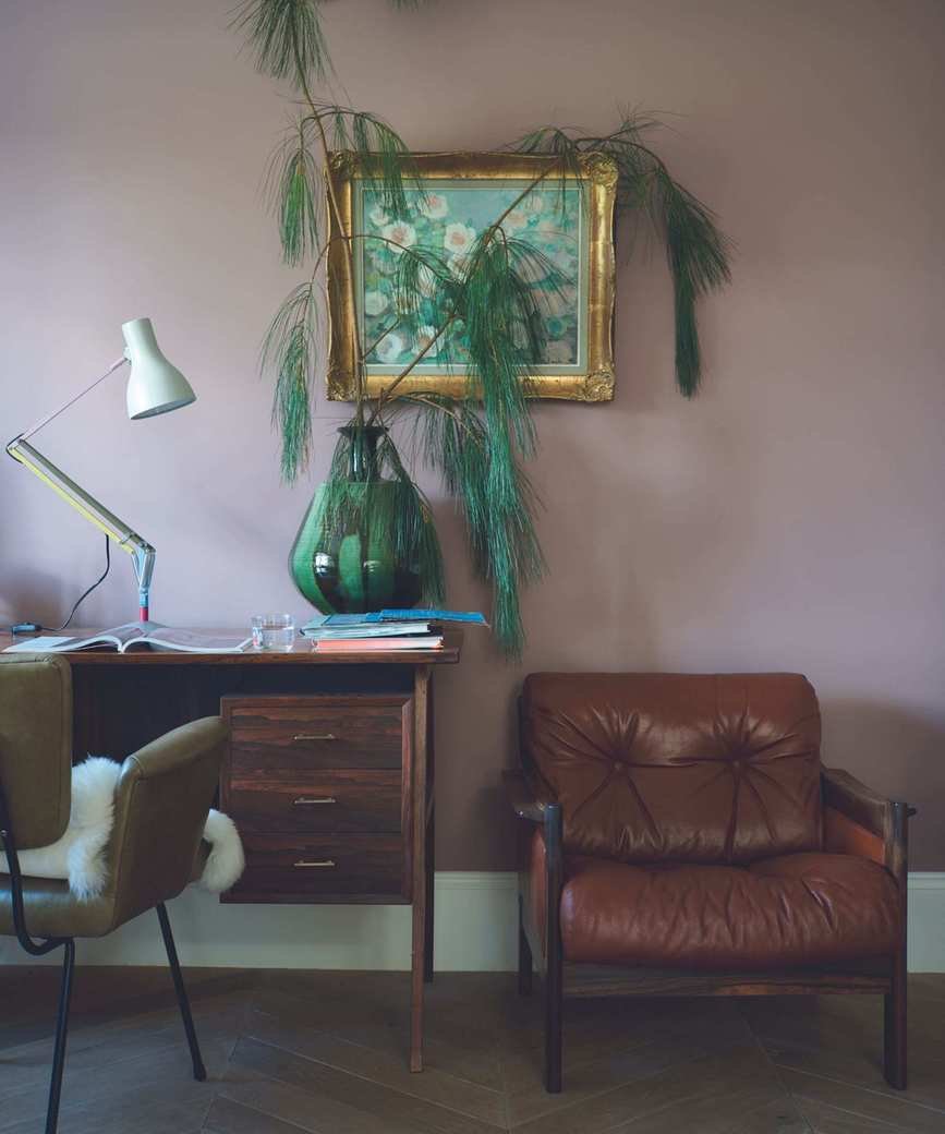
Named after the French term 'bouder' meaning to sulk, Sulking Room Pink evokes the shades found in elegant boudoirs. This muted rose offers warm tones, as Joa describes:
'Sulking Room Pink isn't overly bright; its powdery essence makes it easy to complement with darker hues. It's a nod to the past, perfect for modern walls and furniture.'
Great White is the recommended companion for Sulking Room Pink, a white shade with a hint of lilac that perfectly complements this warm tone.
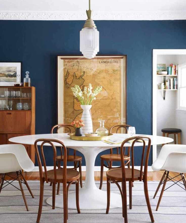
6. Hague Blue
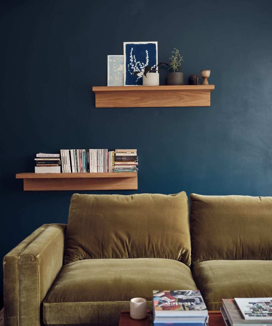
Hague Blue, named after the beautifully colored woodwork in Dutch architecture, is ideal for grounding skirtings or as an accent. This blue features a green undertone, providing warmth, making it a great selection for north- or east-facing rooms.
'Hague Blue exudes period charm and creates a dramatic ambiance,' advises Joa. 'It looks stunning in living areas, especially when paired with dark neutrals on woodwork and ceilings for a sophisticated finish.'
Don't shy away from darker shades; with the right combinations, Hague Blue can be a striking choice along with mid-toned grays and mahogany furnishings.
7. Strong White
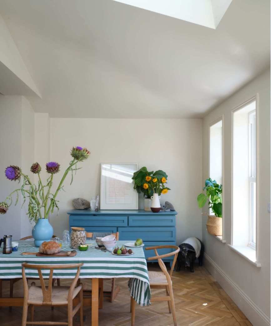
This assertive white, aptly named Strong White, features light gray undertones that add a contemporary flair to traditional homes.
'This gray-based Strong White beautifully complements both period and modern designs,' Joa explains. 'It's particularly favored in kitchens, bringing a fresh yet warm atmosphere when paired with hues like Skimming Stone or Cornforth White.'
Strong White is perfect for brightening spaces or enhancing the illusion of openness, especially in cozy country cottages.
8. Green Smoke
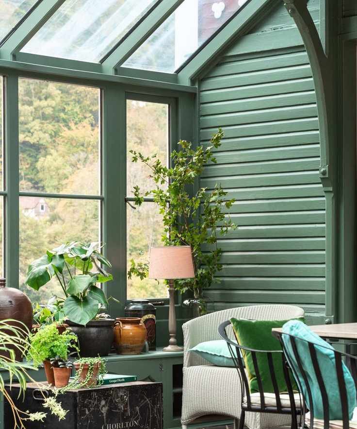
Green Smoke draws inspiration from late 19th-century interiors and offers a muted approach to green decor, making it easy to style throughout your home.
'This deep, smoky green with a hint of blue is inviting, especially in candlelight, and harmonizes beautifully with outdoor surroundings,' Charlotte states. 'It fosters a serene atmosphere in any room, regardless of orientation.'
9. Elephant's Breath
As a favorite for gray decor, Elephant's Breath is a warm gray that allows for a refined look while offering a cozy ambiance.
'Mid-toned grays like Elephant's Breath are incredibly adaptable,' Charlotte explains. 'It radiates warmth with a touch of magenta, appearing almost lilac in west-facing spaces.'
This shade can look deep and earthy with tones like Sulking Room Pink or London Clay, or paired with Strong White for a gentle, neutral feel.
10. Stiffkey Blue
Stiffkey Blue is named for the Norfolk beach where the mud and cockles present a deep navy tone. Although it has a classic feel, it serves as a modern alternative to Down Pipe, creating a richly dramatic space.
'Stiffkey Blue balances drama with optimism, offering a more approachable feel compared to other strong blues,' Joa remarks. 'Its depth makes it suitable for lively spaces as well as serene retreats after a busy day.'
This color can shift depending on lighting; in bright spaces, it appears bluer, while in dimmer rooms, it takes on an indigo hue.
FAQs
Why is Farrow & Ball so popular?
Many appreciate Farrow & Ball for its stunning color palette and high-quality paint. Charlotte Cosby, the creative lead, shares insights into the brand's success.
'Our paints contain high pigment levels, premium resin binders, and top-notch materials, providing unique color depth. We source our ingredients carefully to guarantee the best quality in every tin. Our thoughtfully curated palette includes a range of interior and exterior finishes, and our paints undergo rigorous testing to ensure exceptional color and durability every time.'
For more inspiration, Patrick O'Donnell, Farrow & Ball's International Brand Ambassador, shares insights on three beloved colors in a dedicated feature.


