
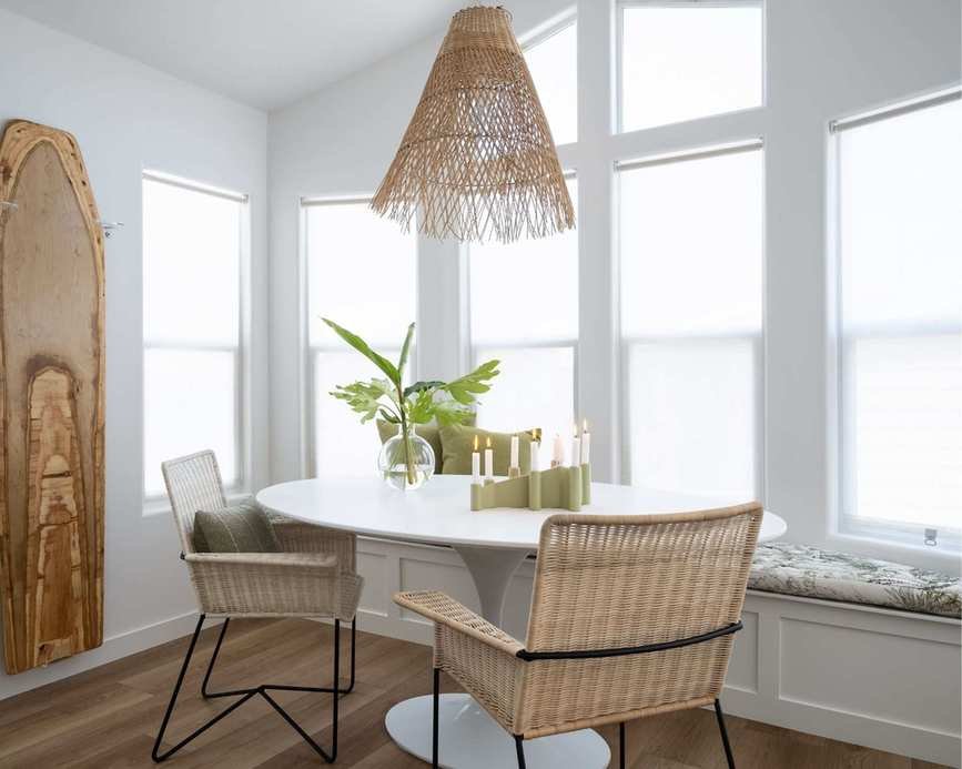
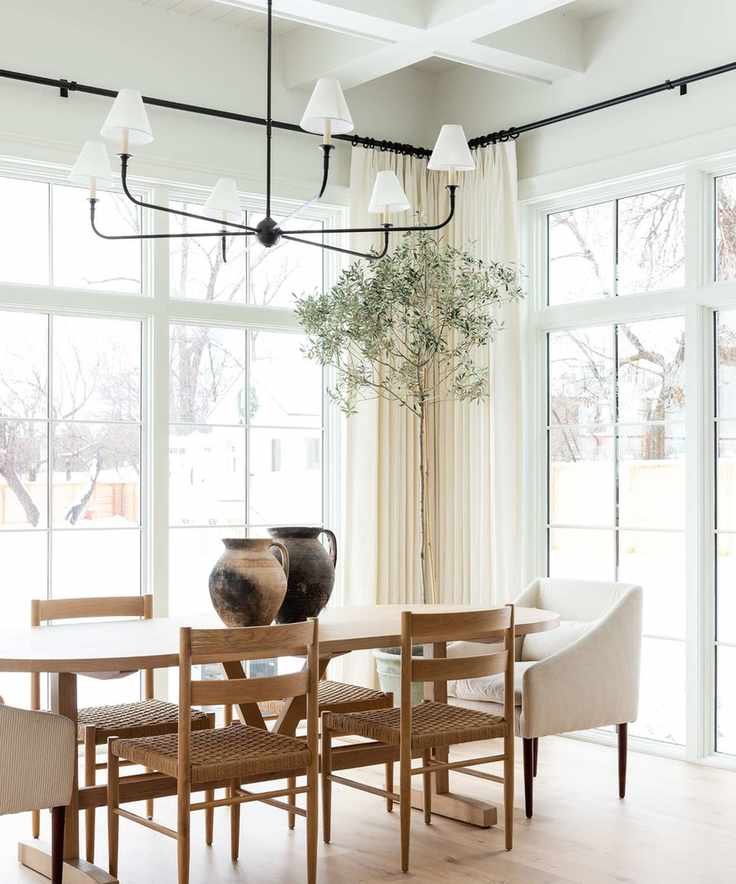
Neutral paint colors come in a variety of shades, from classic whites to warm beiges and cool grays. These hues often serve as the essential backdrop to create the desired ambiance in any room.
Choosing the right neutral paint involves a vast selection tailored for different spaces and design styles. What are the top choices?
We consulted interior designers who shared their preferred paints for decorating with neutrals. These tried-and-true colors are beloved for their timeless qualities and flattering finishes, perfect for inspiring your neutral paint ideas.
Top Neutral Paints: 12 Designer Favorites
From Benjamin Moore to Sherwin-Williams, these top neutral paints span warm and cozy to cool and crisp.
Greek Villa, Sherwin-Williams
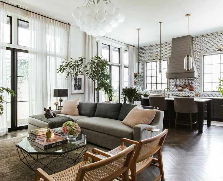
Marie Flanigan, designer and founder of a Texas-based studio, loves Sherwin Williams' Greek Villa. This soft, creamy white offers warmth without a yellow tint, making it adaptable for any setting.
Incorporating Sherwin-Williams' Greek Villa into your color schemes is easy; it's often highlighted by designers for its versatile and flattering appearance.
"It's perfect for living spaces or bedrooms because of its inviting, timeless essence," says Marie. "It beautifully reflects light, creating a serene environment that remains grounded, and it complements both modern and traditional styles for a cohesive look."
Oatmeal, Portola Paints
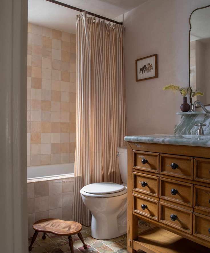
If you're aiming for an earthy vibe, Portola Paints' Oatmeal in Roman Clay finish is an ideal choice. Its warm undertones create a natural feel, adding depth to any plain wall.
This color was chosen for a bathroom in STUDIO KEETA's Glendale Spanish project, paired with similar-hued tiles and a wooden vanity for a timeless ambiance.
Kristina Khersonsky, founder of a Los Angeles design studio, emphasizes that neutral paints should be soft, warm, and familiar without excessive yellow undertones. "We often choose Oatmeal for its subtle peach undertone, creating a vintage effect. For a brighter neutral, we recommend Harvest Moon by Backdrop which adds a creamy hue without being fluorescent."
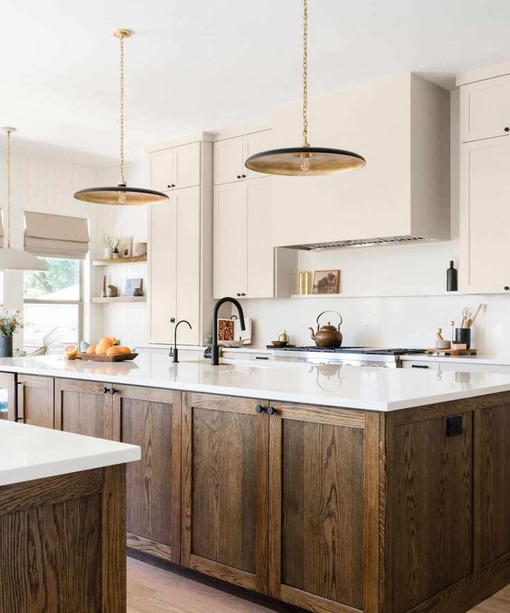
White Dove, Benjamin Moore
Benjamin Moore's White Dove features a cooler undertone and serves as a classic backdrop for bright spaces.
Interior designer Nadia Watts notes, "White Dove is a versatile color I frequently use. Its cool undertones make it user-friendly and especially beneficial in rooms with limited natural light, as it brightens up the space."
"This chameleon color pairs beautifully with vibrant shades, bringing warmth and contrast to creamy neutrals or autumn tones like red and orange," she adds.
Alabaster, Sherwin-Williams

Sherwin-Williams' Alabaster is another beloved warm white. Ali Otterbein, Director of Design at a renowned interior design firm, explains its appeal: "Alabaster creates a serene bedroom atmosphere. It's a creamy white that brings warmth and brightness without being cold. We paired it with Gossamer Veil for a subtle contrast on trims, suitable for various styles from coastal to contemporary."
Tiffany Matthews, lead designer at another design firm, adds, "Alabaster is our top neutral due to its inviting qualities. We recommend pairing it with bold colors to minimize yellow tones or using it throughout walls and ceilings for a cohesive design."
Baby Fawn, Benjamin Moore
Interior designer Ryan Austin Hagood favors Benjamin Moore's Baby Fawn. Described as a neutral shade that adds warmth, it strikes a balance between being inviting and not overly creamy or yellow.
"This versatile color works in various spaces, often applied in a flat finish on walls and satin on trim," Ryan explains.
Accessible Beige, Sherwin-Williams
If you're in search of a dependable beige, Sherwin-Williams Accessible Beige features subtle gray undertones, giving it a contemporary flair.
"I love Accessible Beige for its timeless appeal," says Laura Williams, owner of ATX Interior Design. "It pairs beautifully with other colors without leaning too brown or gray, making it a great alternative to white."
Modern Gray, Sherwin-Williams
If you seek a warm gray, Sherwin-Williams' Modern Gray is a perfect option. This 'greige' shade serves as an enduring background for many rooms.
Shauna Glenn, founder of her design studio, used this color throughout a lively space, complemented by Snowbound trim. "Modern Gray is our top choice for greige shades," she adds.
White Down, Benjamin Moore
Another subtle greige is Benjamin Moore's White Down, used effectively in a light-filled living room.
Interior designer Rebecca Bobroff describes it as a warm undertone color that pairs well with various shades, creating a refined atmosphere. "Test it under different lighting conditions to ensure it complements your space," she advises.
Pure White, Sherwin-Williams
Another popular choice is Sherwin-Williams' Pure White. This clean shade features a hint of warmth, making it both fresh and welcoming.
"My top choice is Pure White," says Allison Garrison, principal designer at Allito Spaces. "It looks fresh without being stark, complements light from any direction, and pairs well with other neutral shades."
Swiss Coffee, Benjamin Moore
"My current favorite is Swiss Coffee by Benjamin Moore" shares Darci Tee, lead designer at TKS Design Group. This warm undertone shade works beautifully in any area, whether on walls or cabinetry.
Kathy Kuo also praises Swiss Coffee, highlighting its versatility with both warm and cool palettes. "This soft neutral also balances wood tones without being stark white," adds designer Sarah Latham.
Rodeo, Benjamin Moore
Designer Cheryl Clendenon identifies Benjamin Moore's Rodeo as her favorite neutral. It strikes a balance between warm off-whites and cooler grays.
"Rodeo is incredibly versatile, fitting seamlessly into various environments, making it a go-to for remodels where finishes are already established," she states.
Bit of Sugar, Behr
Finally, Bit of Sugar by Behr is an off-white that serves as a flattering backdrop.
Designer Thea Bloch-Neal loves Bit of Sugar for its warm undertones, perfect for complementing popular accent colors.
Neutral paints are a timeless choice in design, providing a subtle backdrop that allows decor to shine. Whether you prefer inviting warm tones or the freshness of cooler shades, these specific paint colors are worth considering.


