
Mid-century décor remains a timeless design trend, characterized by its sleek lines and organic shapes. This style emerged from the post-war optimism of the 1950s and 1960s and continues to evolve while captivating home enthusiasts. To truly appreciate mid-century modern design, one must start with a thoughtfully selected color palette that merges modern elements with nostalgic vibes. Often paired with wood and brass accents, these colors evoke a retro charm that enhances any space.
From the earthy richness of teak, oak, and ash to the lively vibrancy of jewel tones, sunny yellows, and refreshing teals, learn how to utilize mid-century color schemes to create a stylish homage to this beloved design era.
Key Color Schemes for Mid-Century Modern Interiors
To help you master retro styling, we consulted experts who shared their favorite mid-century modern color palettes. Discover their insights on achieving this classic look while adding a contemporary twist.
1. Mustard Yellow

If you love bright colors and warmth, mustard yellow is a perfect choice to bring retro comfort into your home. Enhance the mid-century aesthetic by incorporating wooden accents, as seen in this mustard and ash kitchen diner designed by Victoria Maria Interior Design.
'Mustard yellow is a lively and warm hue that contrasts beautifully with gray and ash tones, creating a balanced visual appeal without overwhelming the senses,' shares Victoria-Maria Geyer, founder of Victoria-Maria Geyer. 'This color scheme feels elegant and sophisticated, admired across fashion, interiors, and art for its chic mid-century modern vibe.'
A self-taught interior designer with a unique vision, Victoria-Maria Geyer has had a passion for design since childhood. Based in Brussels, she founded her agency in 2008, embracing eclectic decor and vibrant color schemes that bring joy to spaces.
2. Orange and Teak
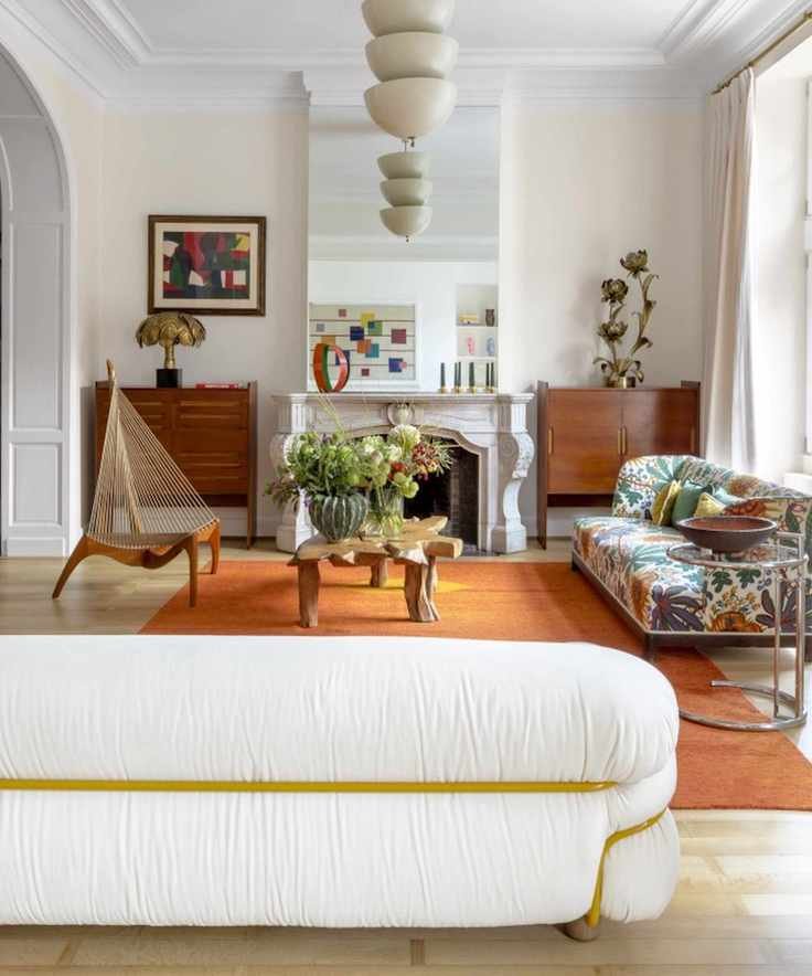
Teak wood is a staple in mid-century modern design, easily found at vintage stores and antique markets. Pairing teak with orange accents enhances the retro appeal, as demonstrated in this striking living room designed by Victoria-Maria Geyer.
'Orange creates a lively contrast against warm woods like walnut, cherry, and teak, adding visual interest and highlighting the wood's natural beauty. This color is closely linked to the aesthetics of the 1960s and 1970s, a time when mid-century design flourished,' says Victoria-Maria.
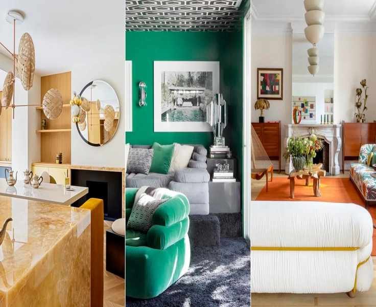
3. Emerald and Black
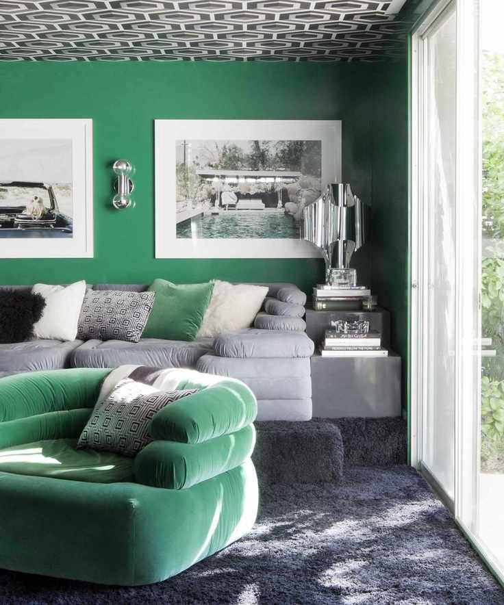
A rich emerald green paired with bold black creates a striking look that feels both timeless and modern. This combination embodies the essence of mid-century modern design. 'Emerald is an excellent choice for mid-century color schemes, capturing the era's vibrant yet refined aesthetic,' notes interior designer Martyn Lawrence Bullard.
'Combining emerald with black offers a dramatic contrast that reflects mid-century boldness. The richness of emerald enhances black's elegance, resulting in sophisticated room enhancements, whether through wallpaper or accent pieces.'

Martyn Lawrence Bullard is an award-winning designer based in Los Angeles, known for his versatile styles and ability to create globally inspired, inviting interiors. He has collaborated with prestigious brands and is also a television personality.
4. Purple and Tan
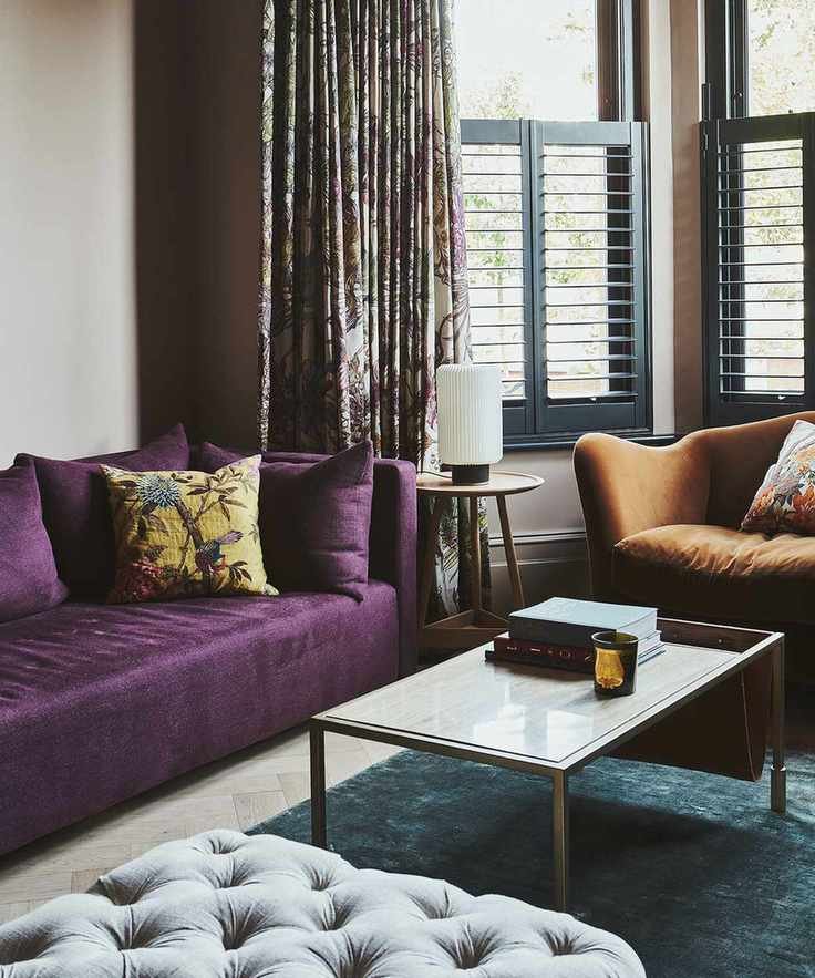
Jewel tones, browns, tans, and leathers are quintessential mid-century colors that evoke the rich aesthetics of the period. The Vawdrey House has successfully utilized purple, emerald, and tan in this cozy living area.
'Deep purple velvet is a perfect fit for mid-century design, transitioning seamlessly between vintage and modern styles without feeling outdated. The burnt orange chair adds warmth, complementing the mid-century vibe, and works well in any decor style,' explains Sophie Chapman of The Vawdrey House. 'Timber accents enhance warm tones, while brass details complement the rich textures of the fabrics.'

As a founding member of The Vawdrey House, Sophie leads the design team, infusing her creativity into projects. With a BA in Interior Design & Environmental Architecture, she enjoys sourcing unique pieces at antique fairs and French markets.
5. Royal Blue and Smoked Glass
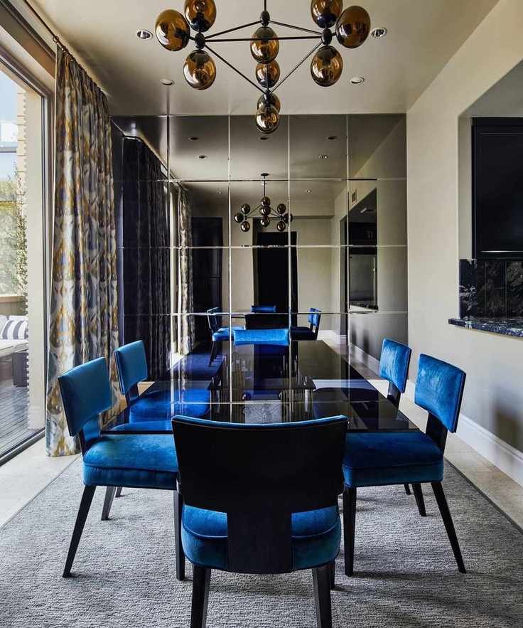
Smoked glass was a popular material in mid-century decor, adding glamor and intrigue. When paired with elegant royal blue, it creates a luxurious impression, blending classic and contemporary styles seamlessly.
'In designing this pied-à-terre, we aimed to combine the richness of Ralph Lauren's American style with a modern, masculine touch, inspired by mid-century principles,' explains interior designer Hanna Li. 'Silk blends for drapery and upholstery provide a tactile experience that exudes sophistication. The royal blue contrasts beautifully with the lush greenery of the terrace, creating a sense of calm with its changing hues in natural light, beautifully complemented by smoked glass elements.'
Hanna Li trained in furniture design at the Rhode Island School of Design (RISD) and has a firm rooted in emotional resonance and visual impact, believing that how a space looks and feels is equally important.
6. Sunshine Brights
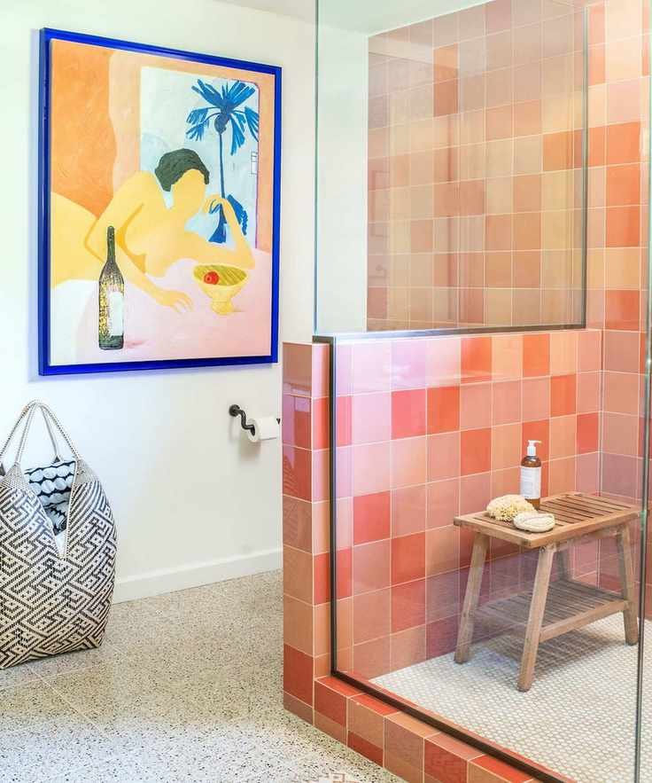
Mid-century modern spaces can radiate joy and energy. Incorporating sunshine brights—reds, yellows, and oranges—brings California-beach vibes into your interiors. North Carolina interior designer Carrie Moore shares tips for using bright colors to uplift your space.
'Sometimes a bright color stands out beautifully on its own with enough space around it. Other times, it needs a contrasting element to create visual tension and harmony,' Carrie suggests. 'In this design, we selected art with a bold ultramarine frame to enhance the tile colors, opting for a more tonal direction with the tiles to achieve a modern feel.'
7. Earthy Beige Tones
Beige decor can be far from dull, especially when infused with mid-century modern elements. Merging beige, creamy stones, and wooden tones creates a calming retro vibe that grounds your home.
'Mid-century modern design often highlights neutral materials like wood, emphasizing a connection to nature,' states Denise Morrison, founder of Morrison Interiors. 'Beige shades create a serene backdrop for the clean lines of mid-century furniture, allowing design features to shine without overwhelming the space. The soft beige palette fosters a welcoming atmosphere, enriched by warm wood tones for depth and character. This timeless color scheme continues to feel fresh.'
8. Brown and Baby Blue
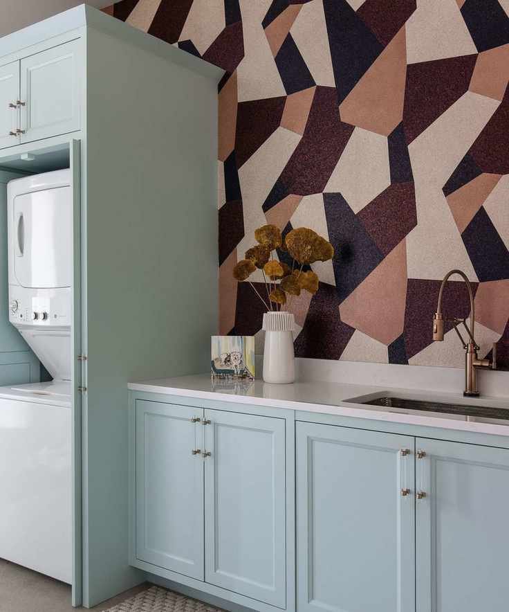
Mid-century modern color combinations can enhance every area of your home, including practical spaces like laundry rooms. The interplay of warm and cool tones brings vibrancy to this laundry room, reflecting mid-century design principles.
'Our goal was to create a colorful, patterned space that respects mid-century design,' explains Lindsie Davis, founder of Blueberry Jones Design. 'We used Sherwin Williams' Waterfront Blue alongside rich brown shades in geometric wallpaper to evoke a playful mid-century feel, while incorporating a subtle baby blue that contrasts beautifully with the earthy tones of the wallpaper, made with real mica flakes in a nod to retro terrazzo.'
Lindsie Davis, the founder and principal designer at Blueberry Jones, has an exceptional talent for color and a knack for mixing styles, bringing unexpected vibrancy to her projects. Based in Texas, she embraces bold colors and sees patterns as neutral elements.
9. Peach and Brass
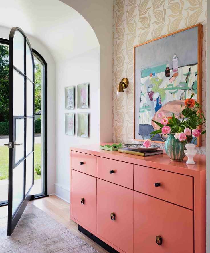
Combining peach with brass accents and mid-century wallpaper creates a fresh, inviting space, as exemplified in this entryway designed by Avery Cox Design. To achieve this look, blend peach and brass with white, Crittall-style glazing, and wooden floors for a pop of color.
'The entryway features a vibrant peach palette, accented by teal, blue, and a bright pink. The addition of black metal hardware and burnished brass sconces keeps the design balanced, preventing it from becoming overly sweet,' adds Avery.
Avery Cox specializes in creating unique spaces that blend architectural details with antique and contemporary styles, offering clients a functional yet stylish environment that reflects their individuality.
10. Teal and Oak
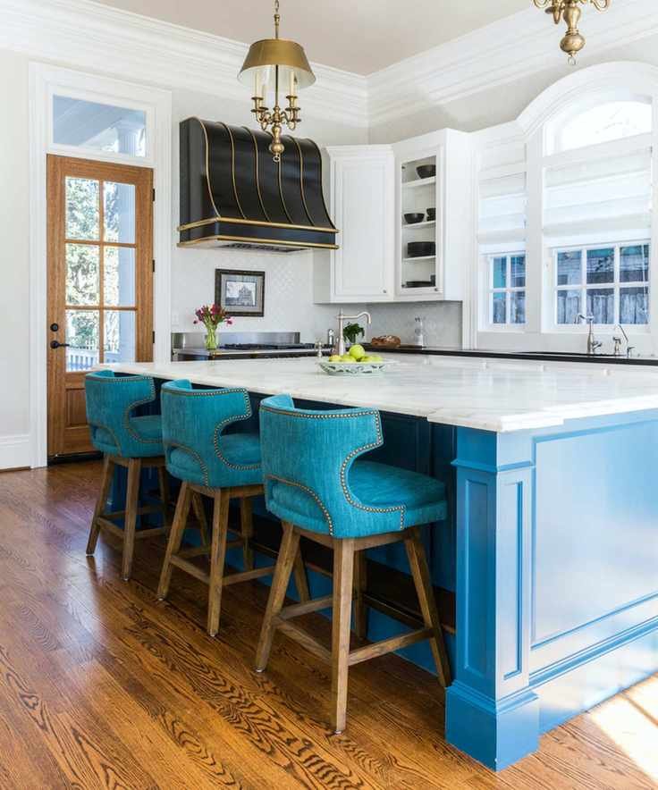
Pairing bright colors with natural wood is a classic mid-century modern approach, according to interior designer Linda Eyles. She advocates for combining teal with oak to create a modern interpretation of retro charm.
'Using contrasting colors from the color wheel, the teal and oak palette harmonizes the space, enhancing both shades' depth. This contrast enriches the overall aesthetic,' she explains.
FAQs
Is purple a mid-century modern color?
While purple may not be as prevalent as mustard yellow or brown in mid-century design, it is indeed a recognized hue in the mid-century modern palette. Shades like lavender and mauve were popularized in the 1950s and 1960s, but today, deeper purples—often in luxurious silks and velvets—are frequently embraced in mid-century inspired schemes.
What paint colors are mid-century modern?
Anjelica Delfino, a paint and interiors expert at V&Co Paint, outlines classic mid-century paint colors. 'During the mid-century, preferred palettes leaned towards soft, inviting hues like light reds, emphasizing comfort and style over strict formality after World War II,' she notes. 'A hint of pink serves as a perfect neutral backdrop for mid-century furniture, paired with subtle orange and deep red accents for a cohesive tonal palette.'
By the 1950s, people began embracing bolder colors, drawing inspiration from nature. 'From cobalt and turquoise blues to deep forest and sage greens, these colors became iconic in homes following Yves Klein's famous preference for blue,' she explains.
'Alternatively, you could opt for an olive green and burnt orange scheme to achieve that classic mid-century aesthetic. Burnt orange adds a playful touch, while olive green introduces the necessary earthiness for this style,' she adds.


