
This year, butter yellow has dominated the color scene, appearing in everything from fashion to home decor. However, its popularity raises the question: is it nearing its end, and which colors might take its place?
Yellow has long been a beloved choice for decorating, and while it won't disappear, opinions are split on the future of the butter yellow trend. Some designers, like Elizabeth Vergara, suggest it's time for a change. 'Once a color becomes ubiquitous, it can feel stale,' she notes.
Yet others believe butter yellow has evolved into a more sophisticated hue. 'It's not finished,' asserts designer Lauren Saab. 'It's now being used in more nuanced ways, transitioning from playful to refined.'
Despite the debate, many designers agree there are several emerging colors that could outshine butter yellow in the coming months. Let's explore these alternatives.
Is Butter Yellow Finished?
Before considering the contenders, it's crucial to clarify that butter yellow is not done for. While it may feel overexposed, Elizabeth emphasizes, 'Enjoying a trend that's popular doesn't make it obsolete.'
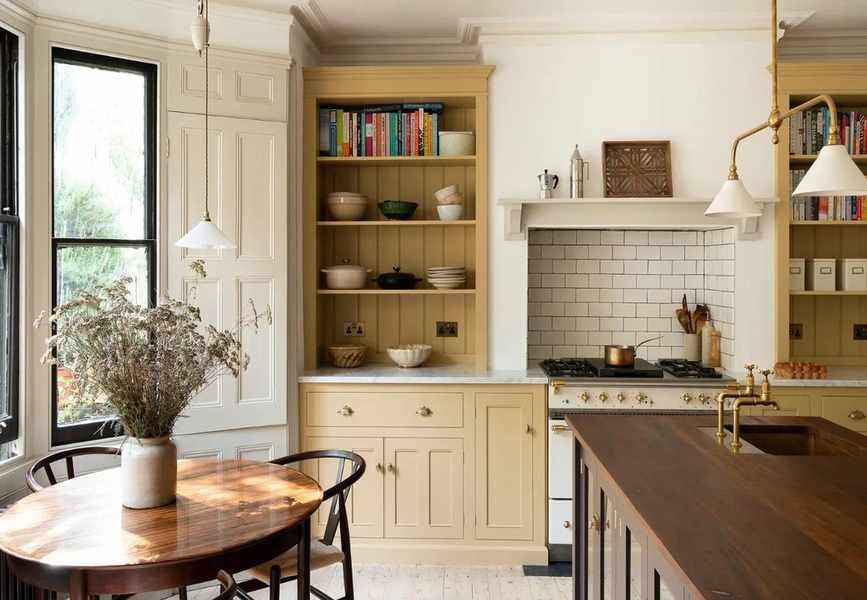
Many decorators continue to favor butter yellow for its uplifting quality, as it is a mood-enhancing color. Celebrities also incorporate it into their homes.
Lauren adds, 'When used with care, butter yellow provides warmth without being overly sweet. It's best as an accent color; when it dominates, it can lose its elegance.'
If you've invested in butter yellow decor, there's no need to worry. This shade remains stylish, but these five colors are poised to take center stage.
1. Sun-Kissed Shades
While butter yellow is a charming hue, it can sometimes lack depth. Deeper sun-soaked colors like ochre and muted clay are emerging as strong contenders. Lauren explains that these shades maintain warmth while offering greater architectural interest. 'They feel less nostalgic and more structured,' she states.
Elizabeth concurs, noting that richer shades like ochre and mustard can provide a timeless feel. 'They pair beautifully with natural materials like oak and linen,' she advises.
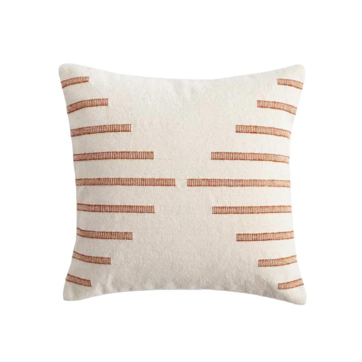 subtle stripe
Quince Stripe Pillow Cover is a perfect way to introduce sun-kissed tones subtly into your decor.
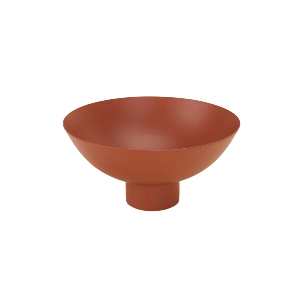 catchall dish
This Hawkins New York Bowl is a stylish choice for any room, showcasing the richness of sun-soaked tones.
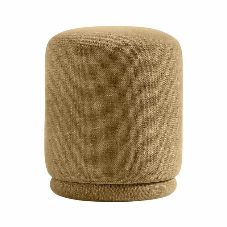 extra seat
This Guest Ottoman from Crate & Barrel offers elegant, versatile seating that can enhance any space.
2. Cobalt Blue
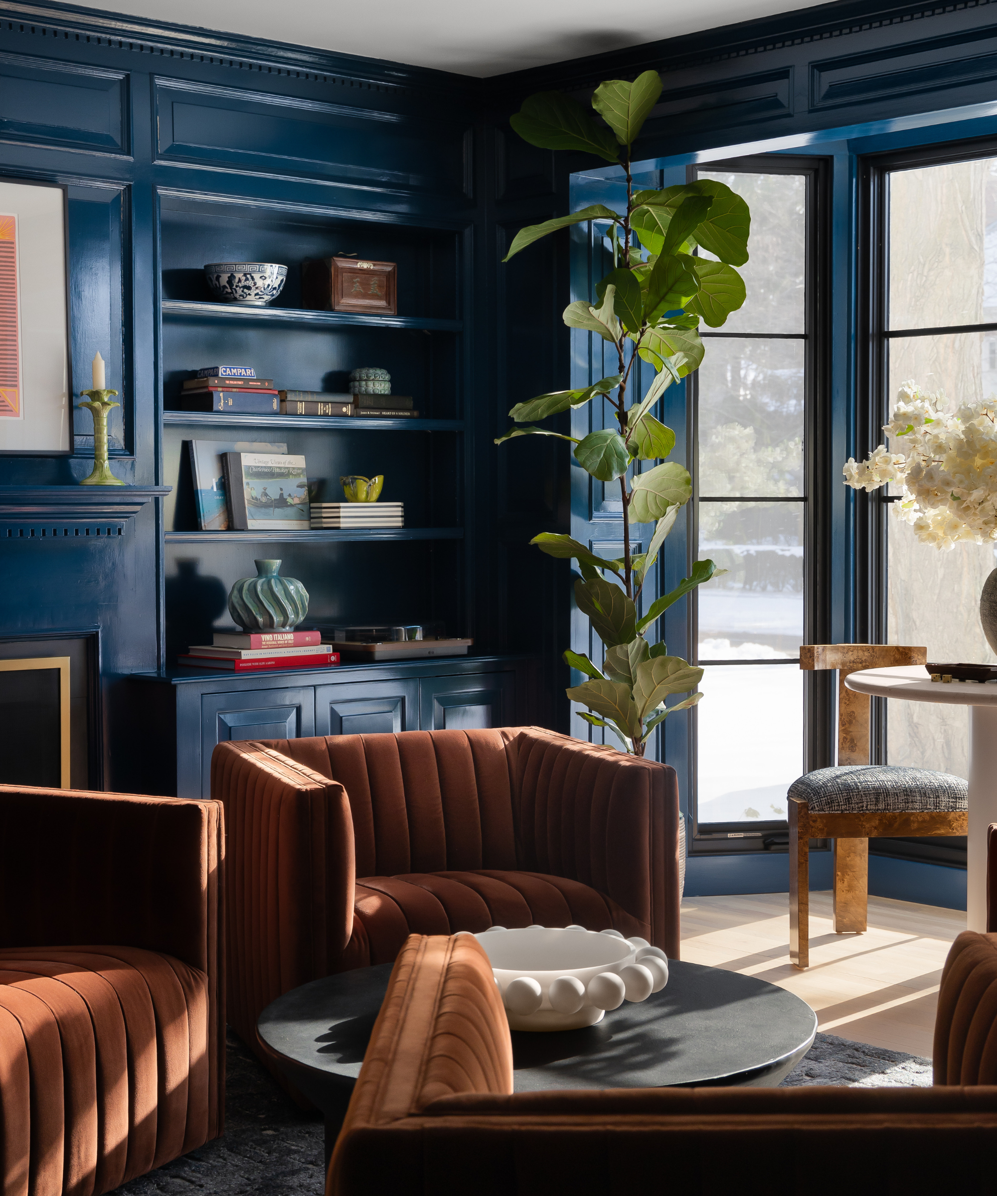
Previously, butter yellow served as a soft neutral within the quiet luxury trend. However, as we shift towards more personalized interiors, bold colors are gaining traction. Designer Jessica Brooks believes cobalt blue could take over the throne.
'Cobalt blue is currently trending in fashion, influencing interior design,' she shares. 'It's a jewel tone with an edge, perfect for those wanting to stay ahead in style.'
This color offers sophistication without overwhelming a space, striking a perfect balance.
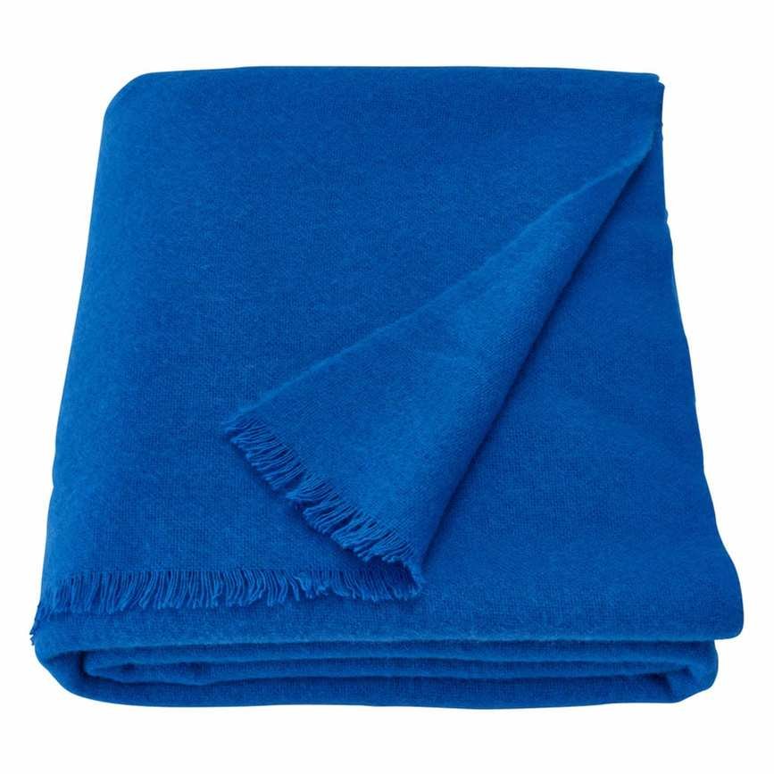 Wool
Wool
The IKEA Stockholm 2025 Throw in bright blue is perfect for cozy nights, adding a cheerful touch to your living space.
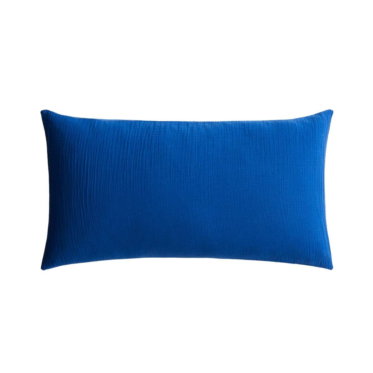 pop of color
Add a touch of cobalt blue with this stylish cotton muslin pillowcase from H&M to enhance your decor.
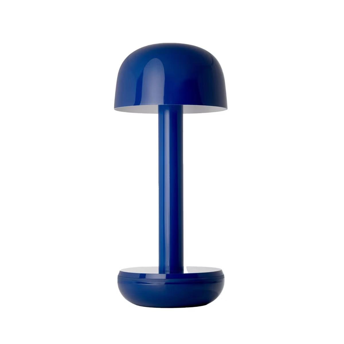 for outdoors
This portable lamp from The Container Store offers an eye-catching cobalt blue shade and up to 96 hours of light, ideal for outdoor gatherings.
3. Light Periwinkle
Butter yellow is cherished for its softness and ability to infuse a space with color gently. Light periwinkle is another contender with similar qualities, as noted by designer Amy Konarzycki. 'It captures the essence of the sky at twilight,' she explains, complementing whites, greys, and bleached woods beautifully.
Benjamin Moore's Windmill Wings exemplifies the calm and elegance of light periwinkle, balancing softness and boldness.
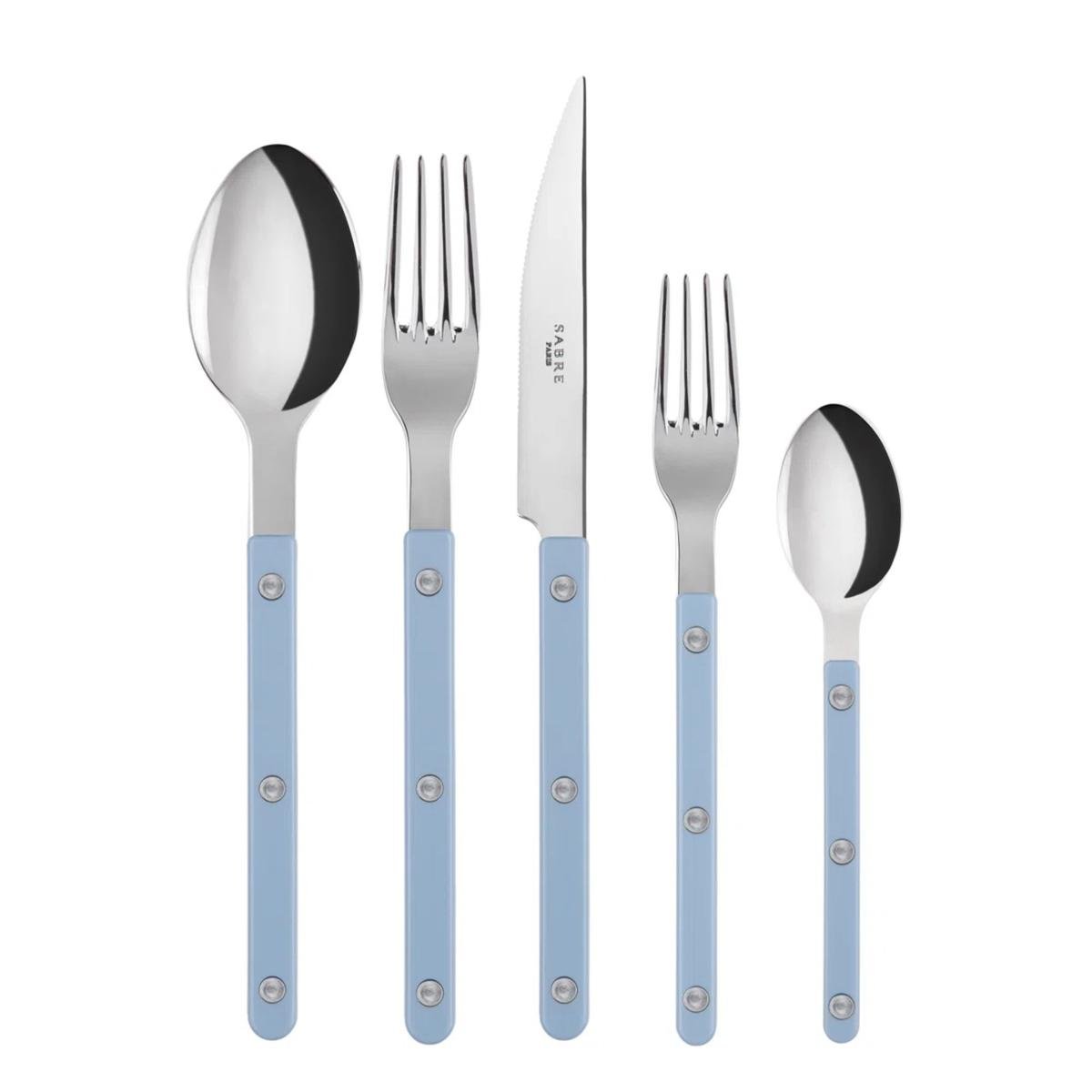 restaurant-inspired
Introduce light periwinkle to your kitchen with this stylish utensil set from Sabre Paris, offering a classic yet lively appeal.
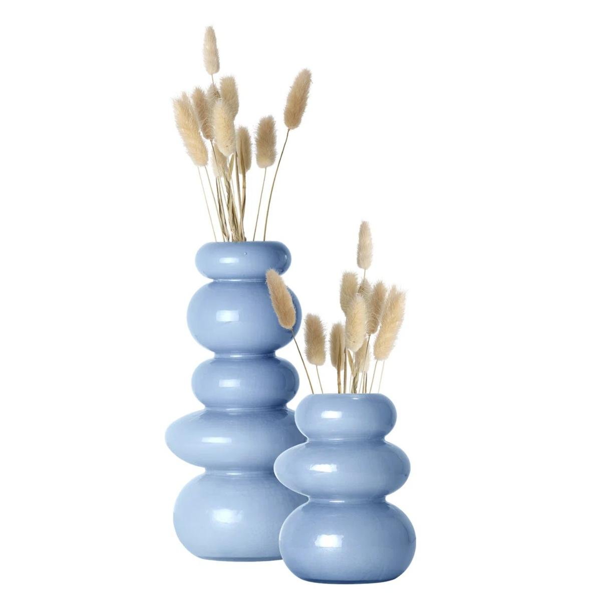 stylish design
This set of two light periwinkle vases from Wayfair, designed to resemble stacked stones, can serve as an elegant centerpiece.
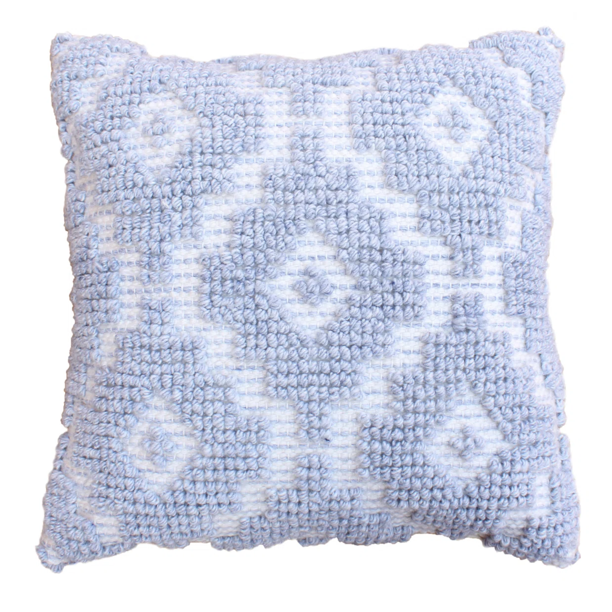 inviting texture
This tufted throw pillow from Dovetail Furniture in light periwinkle is a stylish addition to your couch.
4. Warm Neutrals

Given butter yellow's trendiness, its long-term appeal may be questionable. Those who appreciate its subtlety might opt for classic warm neutrals. Designer Sarah Trop explains, 'Soft yellows can quickly feel dated, while neutrals offer enduring style.'
While buttery yellows belong to the warm category, they may lack versatility. Instead, consider warm neutrals with a pink undertone, which pair well with various palettes.
Sarah recommends Benjamin Moore's Baby Fawn and Featherstone as muted, elegant alternatives to butter yellow.
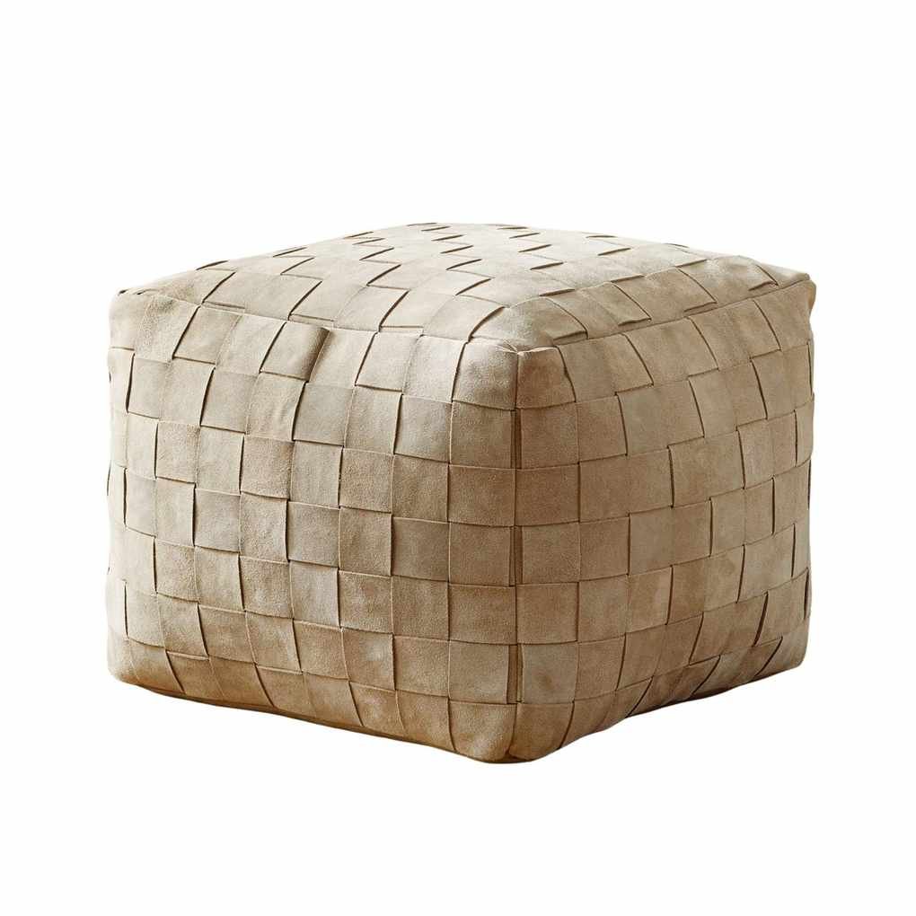 trendy style
This suede basketweave pouf from Pottery Barn is perfect for adding a touch of elegance to your living space.
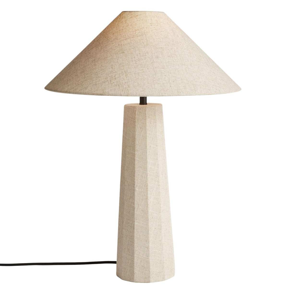 linen
linen
This linen-wrapped table lamp from Rejuvenation adds a naturally elegant touch to any room.
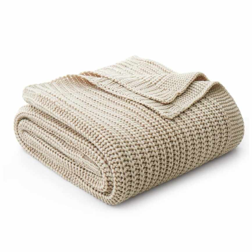 cozy
cozy
This knitted blanket from Wayfair is soft and versatile, making it a perfect choice for any home decor.
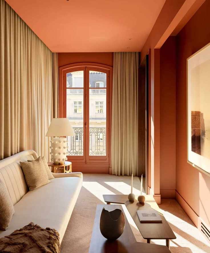
5. Deep Burgundy
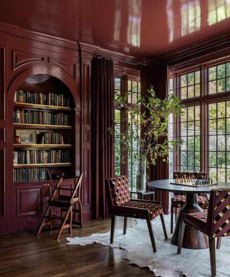
Butter yellow resonates with the summer season, but as we enter the colder months, deeper colors like burgundy are expected to shine. Designer Ashley Stark notes, 'These rich, grounded shades complement neutrals beautifully — they are bold yet welcoming.'
Burgundy and maroon serve as great alternatives to brighter reds, adding warmth that's inviting during winter.
Incorporating burgundy can create a cozy atmosphere that butter yellow cannot achieve. For example, Farrow & Ball's Eating Room Red exemplifies a rich yet inviting shade.
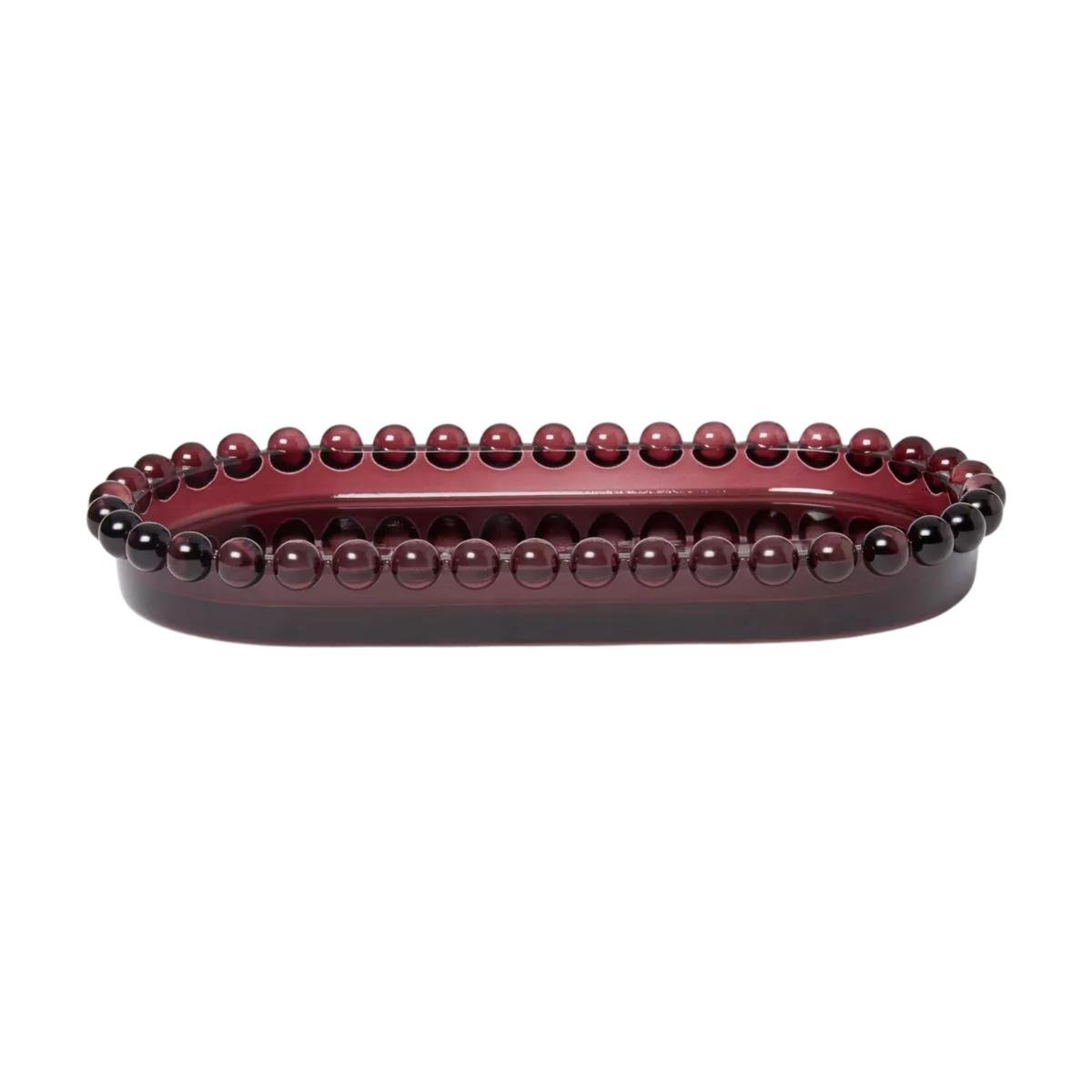 stylish rim
This textured glass tray in mulberry from Target is both elegant and practical, perfect for any decor.
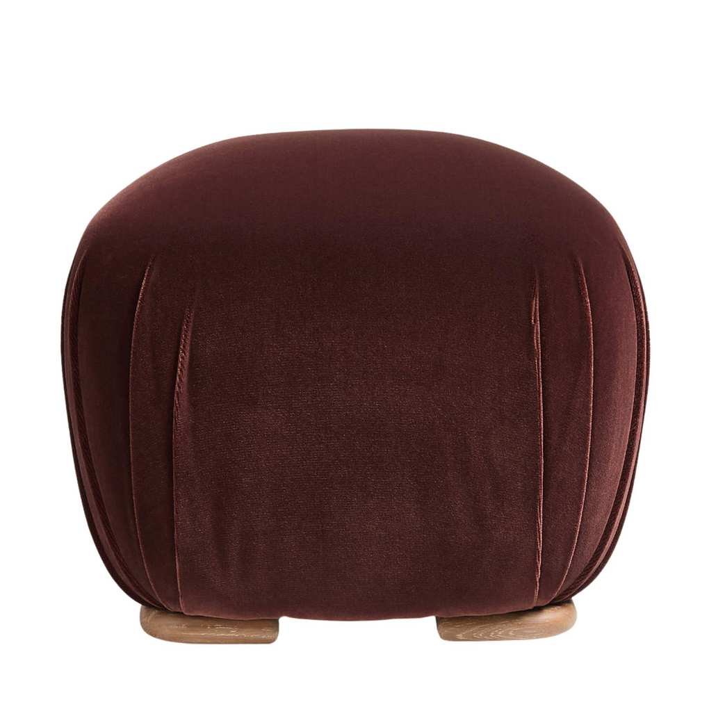 organic shape
This Santa Monica Ottoman by Brigette Romanek combines style and comfort, featuring a plush seat and elegant wooden feet.
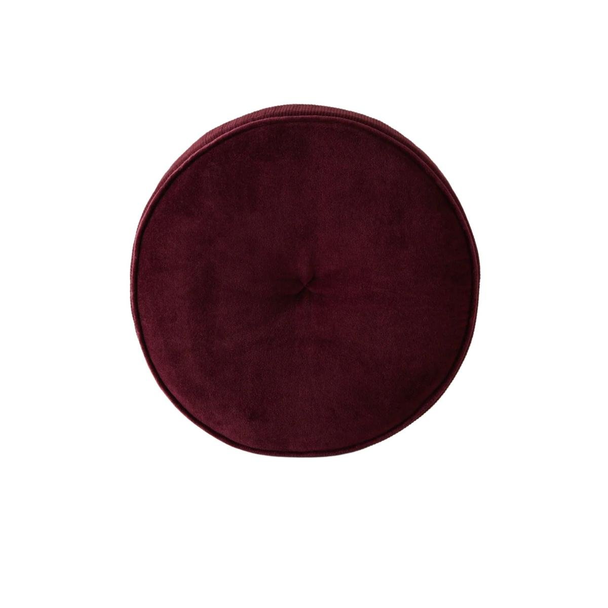 soft texture
This velvet disc pillow from Lulu and Georgia adds a playful touch to any couch, breaking the monotony of standard shapes.
While butter yellow remains a favorite in home design, these five new colors are ready to claim their position as top choices for your next interior project.


