

In a time when neutral tones dominate, a vibrant trend fueled by social media is emerging. The use of primary colors is returning, encouraging bold design choices that invigorate our homes.
From the concept of 'Unexpected Red' to a fascination with cobalt blue, the most notable color trends of 2024 embrace primary colors to add energy and character to our interiors. These lively hues represent the essence of color and are becoming synonymous with a stylishly decorated home.
This trend centers around creating a joyful atmosphere through decor. Unlike maximalism or minimalism, it strikes a balance between both approaches. It's about making an unexpected statement with bursts of primary colors, blending different styles, and mixing prints and patterns.
We consulted design experts to explore how to effectively incorporate this retro-inspired palette into your home.
Understanding Primary Colors

Primary colors are the three foundational hues: red, yellow, and blue. These cannot be created by mixing other colors, yet together they can produce a vast range of shades across the color wheel.
In interior design, the color wheel serves as a guide for selecting room colors, helping to understand how different shades can complement or contrast with one another, influencing the overall mood of the space. While primary colors are the base of all hues, they're often overshadowed by their more popular derivatives. Until now.

This resurgence in popularity is largely credited to TikTok. According to Brooklyn-based interior designer Taylor Simon, who popularized the 'Unexpected Red Theory', these vibrant hues can work in any setting. 'It's a bold statement that stands out,' she states.
She adds, 'You don't need an entire colorful home; even one bright accent can transform a space.' This approach is not just effective; it's often preferred. A touch of red, blue, or yellow can elevate a room's appearance effortlessly.
However, using primary colors can be intimidating. To help, we gathered expert insights on the best ways to introduce these striking shades into your home.
Implementing the Unexpected Red Theory with Primary Colors
1. Start Small with Accents and Accessories

If the thought of decorating with primary colors feels overwhelming, don't worry. The current trend is all about spontaneity. According to TikTok, introducing one bold item—whether large or small—in an unexpected spot can elevate a room significantly. Accessories are a great way to begin.
Things like throw pillows, blankets, lighting, artwork, or decorative pieces in vibrant colors can inject life into a space without committing to a full color scheme.
Katie Logan LeBlanc, co-founder of a design firm, finds that pops of red are particularly versatile, fitting many styles. 'Red can often function almost as a neutral when used in softer shades,' Katie explains. 'It adds warmth and character to any room, harmonizing beautifully with wooden elements.'

Longtime friends, Katie and Jensen founded their design studio in 2012, driven by their passion for art and textiles. They aim to create spaces that both calm and inspire.

Caroline Milns, an interior design head, views primary colors as a dynamic punctuation mark within a space. 'Using bold colors in accessories is the simplest way to integrate them into your design,' Caroline advises. 'It's wise to balance strong colors with neutrals to ground the vibrant tones and mix in bold patterns to soften their impact.'
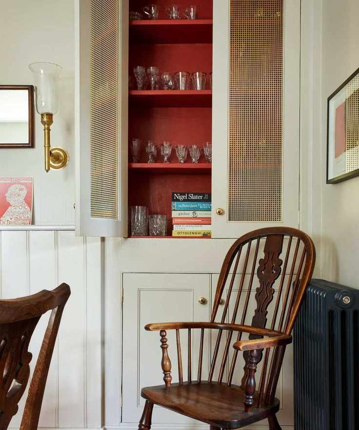
2. Paint Unexpected Surfaces
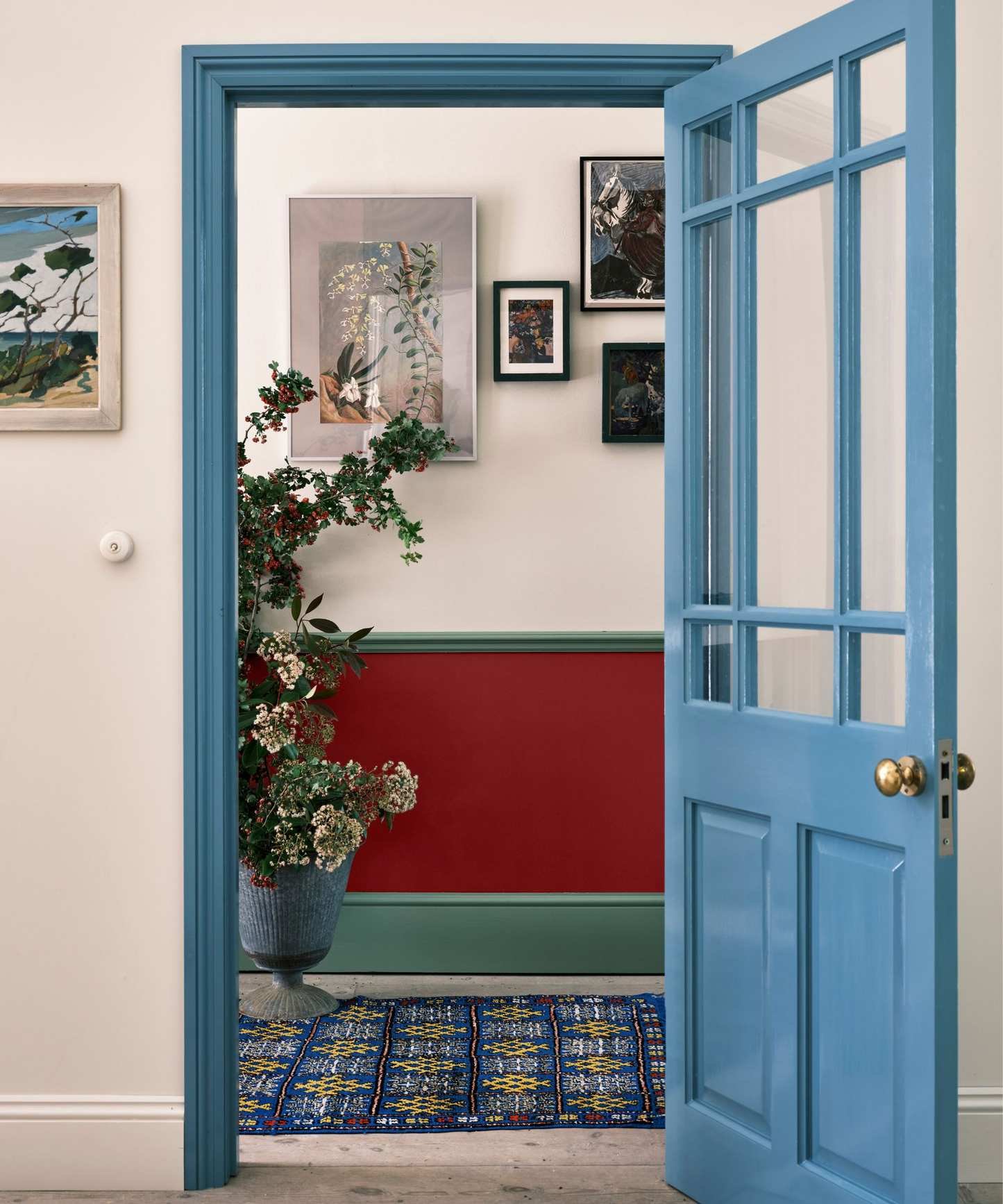
For a more daring choice, consider painting unexpected areas of your home with lively colors. Doors, frames, and even the insides of cupboards can be transformed into personality-filled features. A yellow front door, blue window frames, or a red cupboard interior can create delightful surprises.
'Using stunning primary shades like Stone Blue, Babouche, and Bamboozle in unexpected spots brings joyful color to your home without being overbearing,' suggests a creative director.
'Incorporating these shades into neutral designs, such as painting furniture or areas you might not immediately consider, like the back of bookshelves, can add life to a room without overwhelming it,' she continues. 'Alternatively, for a bold look, use these colors expansively across walls, ceilings, and woodwork for a stunning effect.'

Charlotte transitioned from finance to the creative field, joining a paint company in 2006. She now oversees creative direction, product development, and design.
'Incorporating primary colors can significantly enhance visual interest in any setting,' confirms a marketing director. 'Even if you're hesitant about color, adding a few bright accents can make your space lively and inviting.'
'Painting a single wall or element can help avoid overwhelming your space,' she recommends. 'If your home features architectural details, adding vibrant colors can highlight these elements beautifully.'

Helen Shaw is a color expert and Director of Marketing (International) at a leading paint brand.
3. Use Surprise Elements in Unexpected Places

To fully embrace surprise, look beyond eye level and explore vertical and horizontal options. Ceiling fixtures, painted ceilings, and flooring can dramatically alter the atmosphere of a room. A colorful pendant light or a bold rug can redefine a space.
When a neutral room needs energy, a splash of color can be transformative. For instance, in a muted space, an unexpected red ceiling can create a unifying and intriguing effect.
'Adding yellow can introduce warmth without overwhelming the overall design,' notes a creative director. 'Yellow accents against muted backdrops, such as whites or greys, create a striking contrast.'

A rug can be a focal point or a subtle complement in your design scheme.
'Primary colors may seem intimidating, yet they can easily bring energy into a space,' says a rug designer. 'A bold rug can make a significant impact, offering instant warmth, or it can reflect existing colors in the room, creating harmony and balance.'
'For example, a vibrant rug can create a striking statement, while integrating colors from other elements will unify the decor, allowing the brighter accents to blend seamlessly throughout the space.'
A space filled with vibrant colors is one that radiates personality, joy, and conversation. While not every design trend resonates with everyone, consider the insights and principles from industry experts to try your own colorful experiment.
'Primary colors can infuse youthfulness into a design, particularly when contrasted with more muted tones,' suggests a paint brand CEO. 'Using a bold red for shelving can create a striking accent, pairing beautifully with light blues for a refreshing palette.'
Whether you choose to carefully introduce a few vibrant pieces, paint unexpected surfaces, or boldly explore vertical and horizontal spaces, primary colors can add a playful and retro spark to your interiors.


