
In a realm dominated by neutral tones, pastels have been unfairly dismissed. Often linked with children's decor, they've been seen as overly sweet. Yet, their charm deserves more recognition, especially after the rise of millennial pink, which showcased their potential. Designers have been creatively incorporating pastels into their work, proving that these hues can be both sophisticated and stylish.
Pastels offer a broad spectrum of colors beyond the typical baby pinks and light blues. From soft sage greens to warm peaches and lilacs, there's a pastel for every taste. Whether you prefer a delicate touch or a bolder statement, these shades can enhance any space. We spoke with designers who have embraced pastels in their projects, ready to inspire you to experiment.
1. Rethink Pastel Decorating
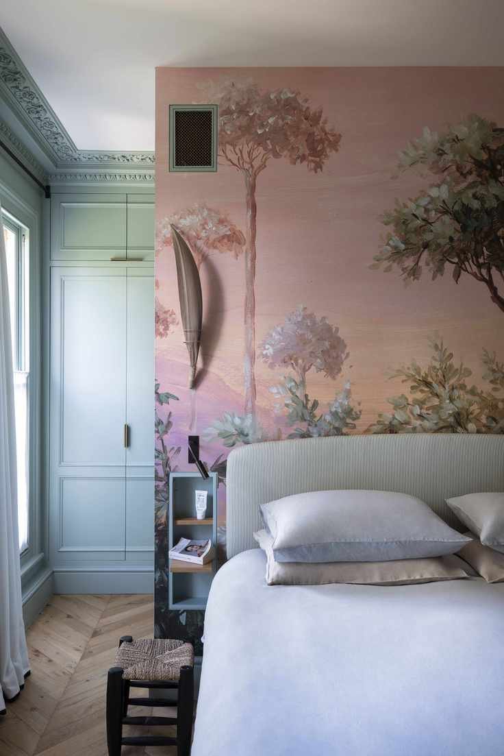
Bedroom designed by K&H Design
Patrick O'Donnell from a leading paint brand suggests shedding preconceived notions about pastels. Treat them like you would grays or creams to unlock new decorating possibilities. By viewing pastels as neutrals, you can introduce dynamic accent colors and textures. Pairing earthy tones or deeper shades with pastels creates a modern and inviting atmosphere.
2. Opt for Earthy Pastels
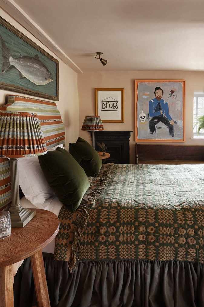
Designed by HÁM Interiors
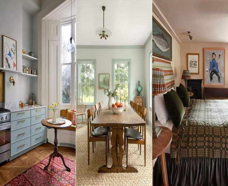
If you lean towards neutrals, consider earthy pastels with a touch of brown. These tones create a grounded, sophisticated ambiance, moving away from the sweetness often associated with lighter pastels. This pink bedroom exemplifies how warm undertones can complement antique decor, adding depth without overwhelming the space.
3. Layer Various Pastel Shades

Photography by Megan Taylor
Think pastels can't fit into adult spaces? This dining nook dispels that myth. The combination of soft pastel tones with bolder accents creates a chic balance. The mid-century furnishings enhance the pastel palette, while hints of teal add necessary contrast, making the space feel inviting and stylish.
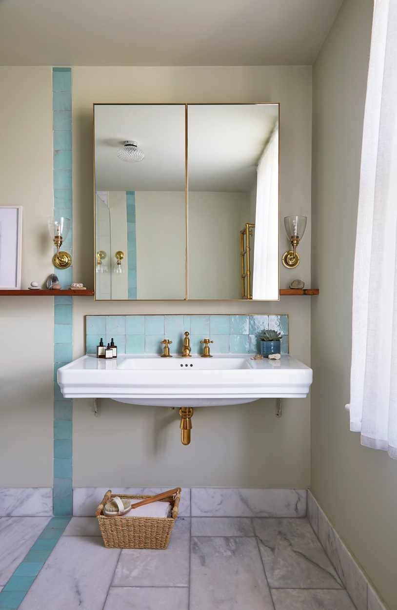
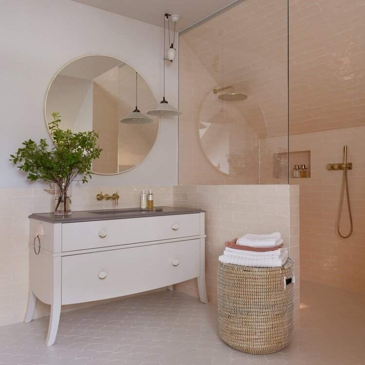
4. Soothing Pastel Greens for Bathrooms
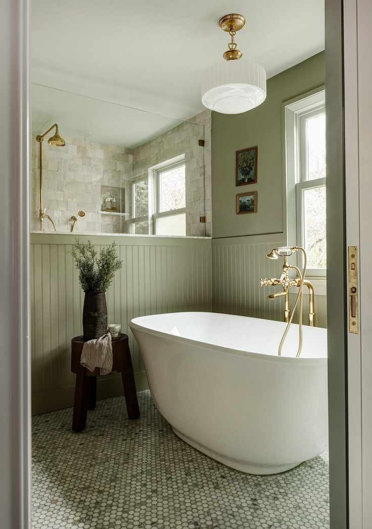
Photography by Carina Skrobecki
Pastel green is an excellent choice for bathrooms, offering a warm alternative to stark whites or grays. When paired with crisp whites and metallic accents, this color creates a refreshing and calming vibe. A recent bathroom renovation showcases how this shade can transform a space into a tranquil retreat.
5. Combine Pastels with Bold Accents
Designed by Yellow London
This apartment illustrates how pastels can be lively yet chic. The mix of pastel pinks with vibrant reds and turquoises creates a playful yet cohesive look. Pastels maintain a soft feel while allowing for colorful experimentation, resulting in a fresh and inviting atmosphere.
6. Use Dark Accents to Ground Pastels
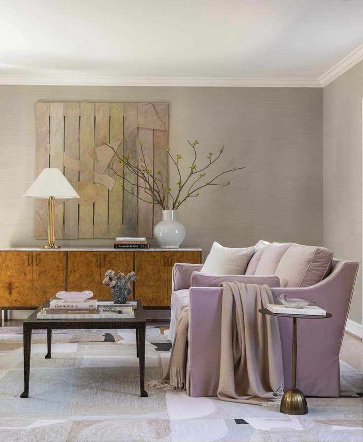
Photography by Julie Soefer
Marie Flanigan encourages mixing different saturation levels within a pastel palette. This technique adds depth without becoming monotonous. Incorporating darker hues alongside pastels introduces contrast and sophistication, balancing the overall aesthetic of the room.
7. Introduce Pastels with Tiles
Photography by Anna Stathaki
If a full pastel scheme feels daunting, consider adding pastel tiles as an accent. This bathroom effectively uses pastel blue tiles to create a modern yet playful vibe, enhancing the overall aesthetic while maintaining a clean look.
8. Create Serenity with Light Blues and Greens
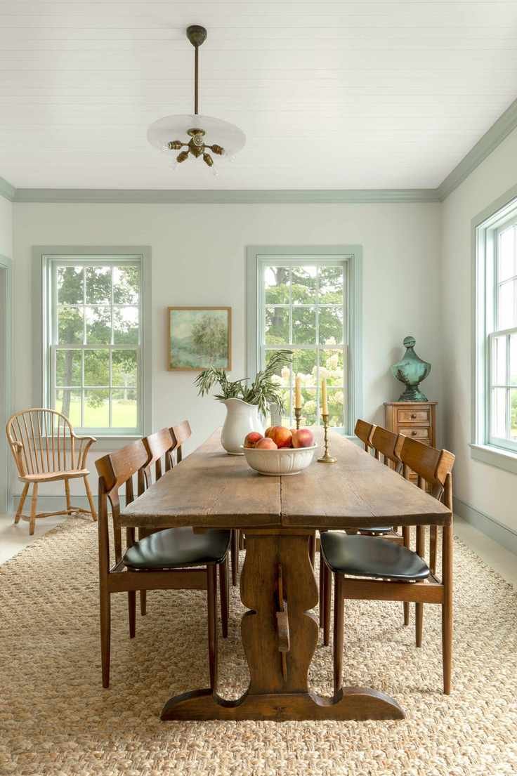
Photography by Allyson Lubow
Victoria Holly emphasizes lighter tones to foster a calming environment. This dining room showcases how pale pastels can create an airy feel while contrasting with darker accents to ground the space, resulting in a serene and inviting atmosphere.
9. Use Pastels as a Backdrop

Photography by Anna Stathaki
Pastels can effectively serve as a soft backdrop for more vibrant decor. This kitchen design uses pale blue to create a gentle canvas for colorful textiles and furniture, allowing bolder elements to shine without overwhelming the space.
10. Mix Your Pastels
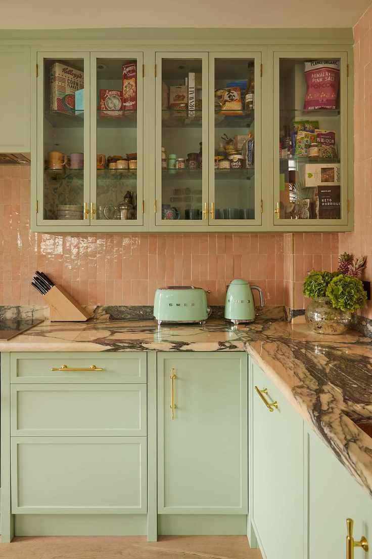
Photography by Alicia Waite
Pairing pastel pink with sage green breaks the old color rules and creates a harmonious look. This kitchen balances the two colors effectively, enhancing the space without overwhelming it. Opt for varying textures to add depth to the combination.
11. Embrace Soft Greens
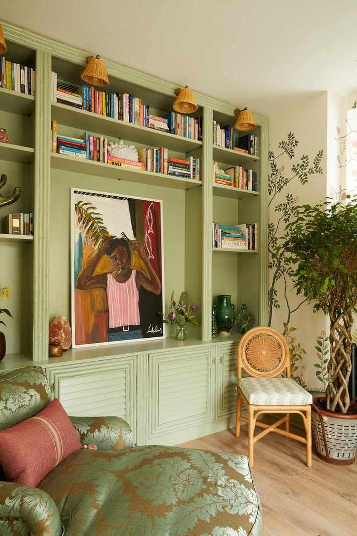
Photography by Alicia Waite
Pastel greens are trending for their versatility and calming effect. These shades can seamlessly blend into various decor styles, providing a gentle touch that enhances rather than distracts from other elements in the room.
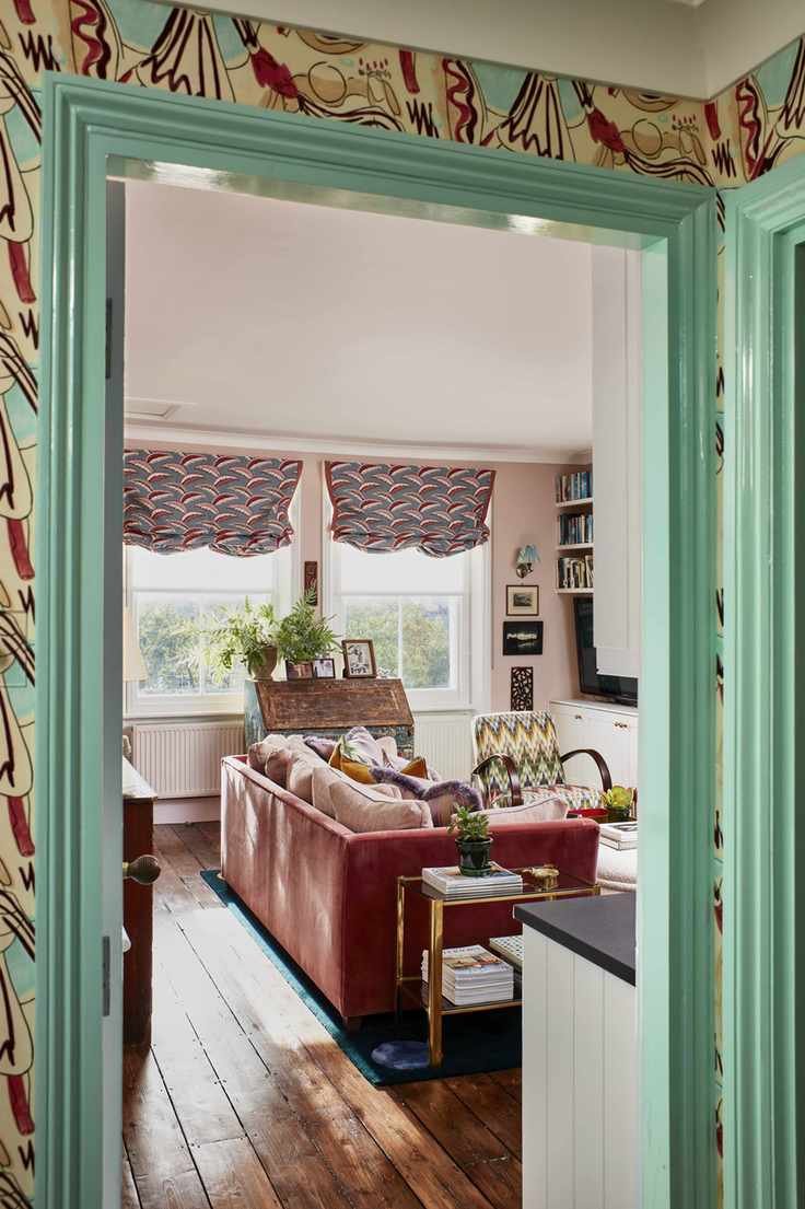
12. Experiment with Patterns
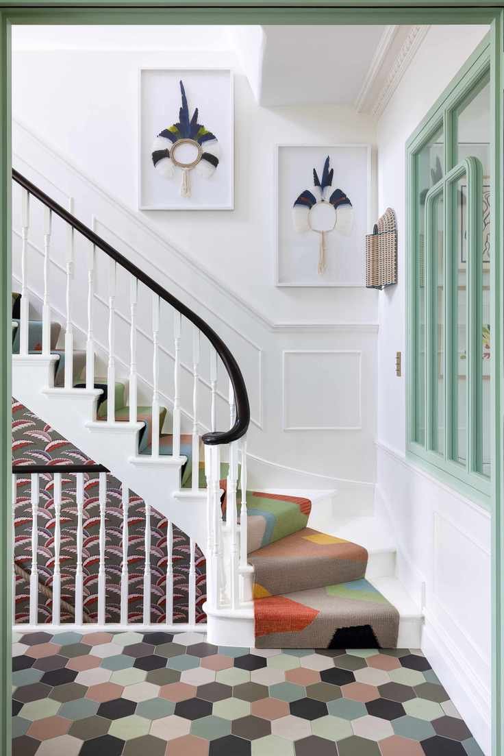
Photography by Paul Raeside
Using pastels allows for bolder patterns without overwhelming the space. This entryway successfully combines various prints, creating a lively yet harmonious look. Mixing multiple pastels can lead to a fun and stylish environment.
13. Pair Pastel Peach with White
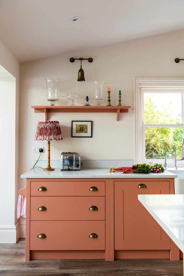
Designed by British Standard
Colorful kitchens are increasingly popular, and pastel peach is making a statement. This combination of soft peach tones with white accents creates a fresh and airy feel, especially in spaces lacking natural light.
14. Color Drench with Pastels
Designed by Studio Duggan
Color drenching is a bold trend that works beautifully in spaces like bathrooms. Using the same pastel across walls and fixtures adds a cohesive look, enhanced by varying textures for visual interest.
15. Brighten Entryways with Soft Yellow
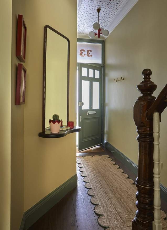
Photography by Sarag Griggs
Yellow often gets overlooked in decor, but muted pastel yellow can be a welcoming choice for hallways. This design pairs yellow with green, creating a cheerful yet sophisticated entry that invites exploration.


