
Blue has consistently been a favorite in home design, standing alongside white and gray as a top choice for decor. This year, several shades of blue have emerged as the Colors of the Year, dominating the trends.
'Blue hues possess a timeless charm, merging sophistication with tranquility,' shares Anu Jain, founder and designer at Atelier Oleana. This versatile color is an excellent selection for anyone looking to embrace popular trends.
So, what are the top blue paints out there? With options ranging from deep navy to soft sky blue, we consulted designers and color specialists to find their favorites.
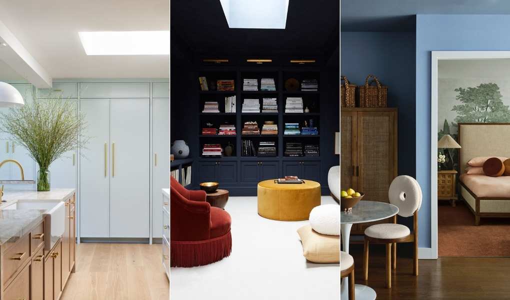
5 Recommended Blue Paints
Selecting the right blue paint can be tricky, as lighting can significantly impact how the color appears in a room. For a north-facing space, a cool blue can help balance out warmth, while a more inviting hue may be ideal for south-facing areas. Here are the expert-recommended shades and the reasons behind their choices.
1. Glacier Point, Portola Paints
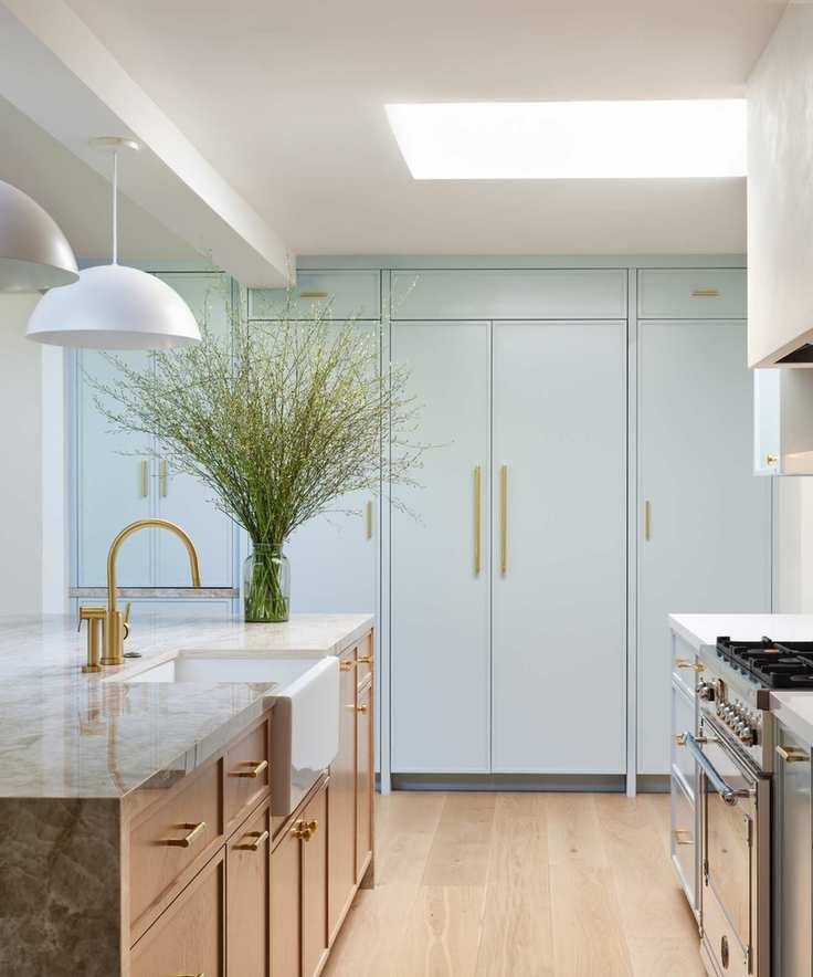
'I've recently been attracted to lighter, playful colors like this cabinet hue from a past project,' says Anja Michals, founder of Anja Michals Design. The shade, Glacier Point, radiates a soft sea-foam vibe, adding a vibrant yet gentle touch to spaces. It's perfect for those seeking a bright, airy feel, particularly when paired with whites and metallics.
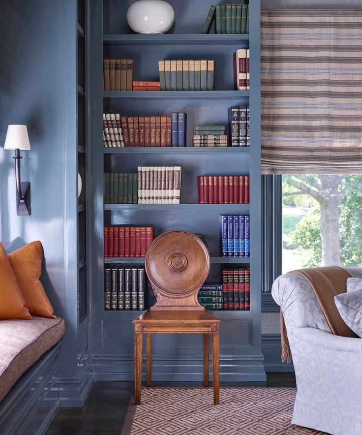
2. Hague Blue, Farrow & Ball
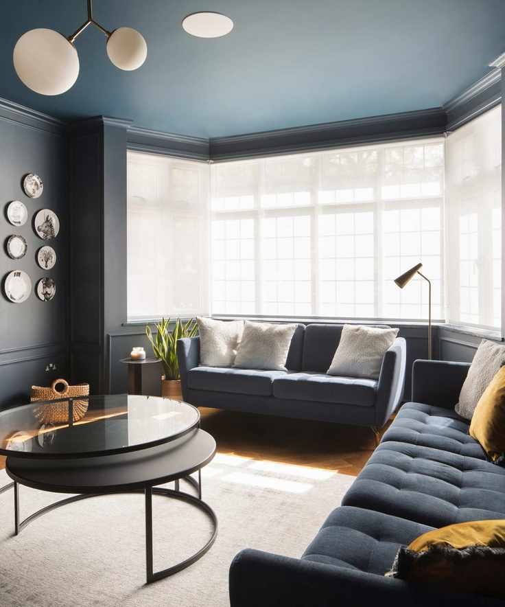
Hague Blue from Farrow & Ball is a longstanding favorite of Tom Rutt, director at TR Studio. He notes, 'This blue instantly defines a room, providing depth and drama. We've used it extensively in large spaces, including walls, ceilings, and cabinetry. Its subtle green undertone enhances its serene mood, making it both rich and calming.'
3. Lulworth Blue, Farrow & Ball
'To elevate a space effortlessly, I rely on Farrow & Ball's Lulworth Blue,' states Anu Jain of Atelier Oleana. This calming mid-blue, named after Dorset's Lulworth Cove, brightens areas beautifully. It pairs wonderfully with greens, creating a lively atmosphere and transforming with the changing light throughout the day.
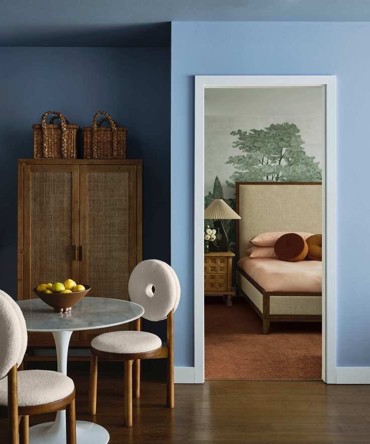
4. In The Navy Roman Clay, Portola Paints
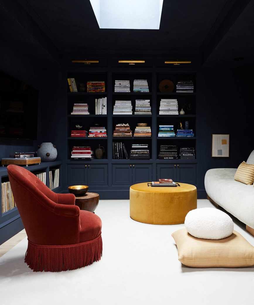
Athena Calderone, founder of Athena Calderone, describes her family room's transformation: 'Initially, I aimed for a neutral palette, but the space felt incomplete. By using In the Navy Roman Clay, we achieved a cozy yet formal library feel. This deep blue enveloped the room, infusing it with character.' The balance of cream furnishings and hints of rust adds a stylish flair.
5. Templeton Gray, Benjamin Moore
'From the Historical Colors collection, Templeton Gray has become one of our most requested shades,' says Dan Mazzarini, creative director of ARCHIVE and BHDM Design. 'Though it's named gray, it presents as a blue with green undertones, adapting beautifully to its surroundings. It's ideal for millwork and as a standout color for kitchen islands or libraries.'
Offering a stylish blue-green hue with depth, Templeton Gray changes character throughout the day, making it versatile for various decor styles.
Blue symbolizes peace and tranquility, making it a dependable choice for decor. To avoid a cold atmosphere, pair blue with warm accents like coral and blush, or for a sleek modern look, combine it with crisp white.


