
Although gray has been a popular choice for many, it's not suitable for every space. There are moments when you definitely should not opt for this shade. While it can indeed be a classic neutral, it's easy to get overwhelmed by its prevalence while selecting colors for your rooms.
For an extended period, gray dominated interior design, but its appeal has diminished significantly in recent times. 'Many see gray as a symbol of uncertainty and indecision, making it the go-to color for decorating,' notes designer Fiona Duke. 'While gray can offer versatility, one must choose it thoughtfully, as the wrong shade can feel cold and uninspiring.'
For those who still adore gray, it's wise to approach its use cautiously. In specific contexts, gray can be more of a blunder than a brilliant choice, making it one of the least favorable colors for some rooms.
In this piece, we explore the rooms where painting with gray is a poor decision, and suggest alternative color ideas that can enhance the space and elevate your mood at home.
1. In North-Facing Rooms
When considering paint options, the room's orientation is crucial. In a north-facing space, remember that northern light tends to accentuate cooler tones. If you prefer lighter shades, it's best to steer clear of grays and blues entirely.
'North-facing rooms lacking natural light are better suited for vibrant, intense colors. A hue with more pigment will appear bolder and more engaging,' advises interior designer Fiona Duke.
The cooler undertones of gray will be intensified by the northern light, resulting in a space that feels cold and dismal. The more gray you use, the icier and duller the atmosphere will become. Instead of fighting against nature, embrace the unique light in these rooms with a darker, moodier color scheme that will transform the ambiance into something cozier and more inviting.
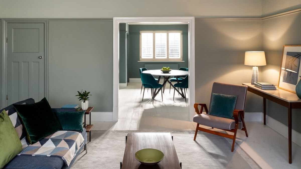
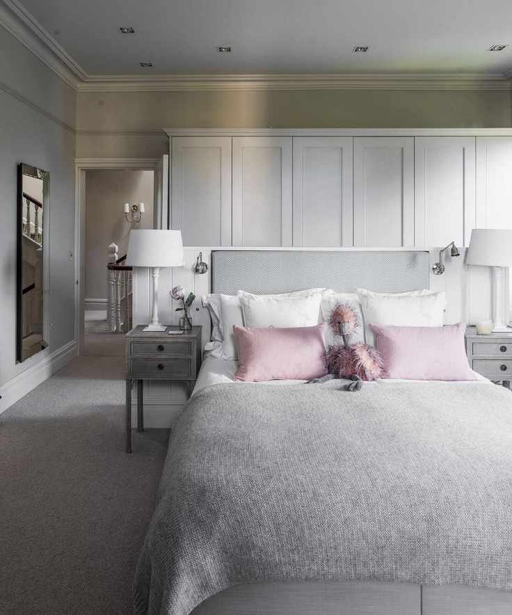
2. In Bedrooms
When designing a bedroom, it's beneficial to consider the most calming colors. Color psychology indicates that cool shades promote feelings of tranquility and introspection.
You might think gray would be a fitting choice for a peaceful bedroom. However, the cool-toned colors that create restful environments typically feature blue or green undertones, or soft neutral shades. Conversely, gray's steely appearance can make a room feel stark and even somewhat depressing.
'Bedrooms should exude warmth and serenity, so opting for gentle greens or warm neutrals will create a more soothing atmosphere than gray,' recommends Fiona. Soft blues, greens, and warm neutrals can make a room feel balanced and serene, far more appealing than gray's often dreary presence.
3. In Rooms with Harsh Artificial Light
After evaluating the room's orientation and natural light, the next essential consideration is the artificial lighting present.
Halogen and incandescent bulbs emit yellow light, which warms up colors, whereas white bulbs produce a blue light that cools down the paint tones. In this case, gray is the least suitable color, as it will create an excessively cold and harsh environment.
The same applies to overhead spotlights, often found in kitchens, utility rooms, and entryways. While these lights are functional, they can create unflattering shadows that amplify the coolness of gray paint, making it look stark and heavy. So, what's a better option?
'We've observed a clear shift away from the cool, blue-toned grays that were trendy in the past,' explains Ruth Mottershead, Creative Director at Little Greene. 'Consumers are now leaning towards warmer, natural neutrals, opting for earthy tones that bring warmth.' Even under unflattering lighting, earthy neutrals like stone, light taupe, or a soft mid-tone off-white would be significantly more appealing.
4. In Dining Rooms
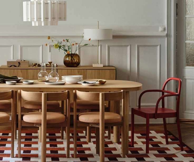
There are plenty of delightful dining room ideas to create a lively, welcoming atmosphere. Painting it gray, however, is not one of them.
'Gray is a cold and dreary color,' states interior designer Lolita Colenso. 'Dining rooms should avoid gray. When searching for authenticity, consider bold and bright colors that align with art deco aesthetics and uplift the mood.'
Spaces designed for social interaction, where you want to foster comfort and joy—such as dinner parties and game nights—shouldn't incorporate gray, as it can dampen the atmosphere.
'Dining areas or open-plan kitchen dining spaces should feel inviting and filled with positive energy, as these are the places we cherish to socialize with friends and family,' Fiona explains. Using gray can sometimes result in a flat and uninspiring vibe, not the best foundation for lively gatherings. Bold, cocooning colors can encourage engagement and creativity, bringing more energy into the space.'
5. On Kitchen Cabinets
Even though gray has been a common choice for new kitchen designs, it has notably fallen out of favor. Using a bland gray for kitchen cabinets can make the area feel uninspired and lifeless. If you're considering painting your kitchen cabinets gray, be cautious, as it may result in a clinical and overly sterile impression.
If you appreciate the calmness of cool gray, think about selecting a neutral that resembles stone or sand instead of a gloomy gray. If deep graphite is your preference, testing navy or petrol blue paints alongside gray could be a great alternative. For a whisper-soft gray, try it with a creamier off-white shade, which will appear more vibrant and uplifting.
If you still cherish this color and seek ways to utilize gray effectively, rest assured that there are shades that can look fresh and modern. Grays with green undertones, like French Gray by Farrow and Ball with its warm green hue, or Grays Inn by Mylands, which is a notably warm and soft take on gray, can be refreshingly easy to work with. Gray does have its place and can be used effectively. In south-facing rooms, gray can bring a calming aura, and in small accents like woodwork, banisters, and doors, it can serve as a subtle and tasteful detail.


