
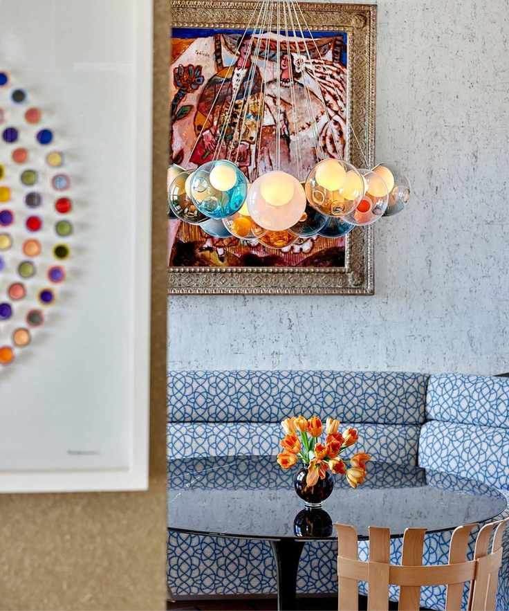
High-contrast colors are making waves in interior design, providing depth and visual excitement. This approach diverges from the calming nature of tonal palettes, bringing unexpected flair to any room.
To make the most of this daring color trend, we consulted design experts and paint specialists. Whether you prefer vivid clashes or subtle contrasting touches in neutral spaces, there are plenty of inspiring ideas available.
Understanding Contrasting Color Schemes
While tonal palettes have been popular, many designers now favor contrasting schemes that create impact and expression. Ruth Mottershead, a Creative Director, shares insights on this trend:
“Layering color in your space can be achieved through various paint techniques. Since we introduced the color-drenching method in 2021, we've noticed clients gravitating towards bold, rich hues from floor to ceiling, resulting in inviting, engaging environments.”
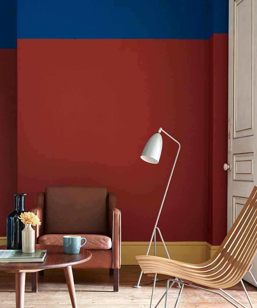
“Another method to enhance depth is by using contrasting colors that complement each other while also providing distinct differences. You could accent your living area or bedroom with a contrasting color on trim or paneling for a focal point.”
“Alternatively, paint a couple of walls a contrasting color to visually separate areas within an open floor plan. A classic combo like red and green works well, as they sit opposite each other on the color wheel, offering a confident contrast perfect for lively spaces like kitchens or utility rooms,” says Ruth Mottershead.
Expert Tips for Decorating with Contrasting Colors
We’ve compiled some stunning examples of rooms that embody contrasting color schemes. While complementary colors are a straightforward approach, you can also pair lighter and darker shades that harmonize without clashing.
“High contrast doesn’t necessarily mean the colors will clash,” says designer Nureed Saeed. “Consider combinations like a saturated blue-green paired with deep coral, or a bright blue with golden-orange. Exploring beyond traditional hues opens up exciting possibilities.”
Incorporate Jewel Tones for Contrast
“Using contrast is a great way to make a statement without overwhelming the space,” shares interior designer Kathy Kuo.
“I favor selecting a rich jewel tone, such as navy blue or forest green, and pairing it with a warm neutral like ecru or peach. This approach ensures both visual interest and elegance that fits various design styles,” Kathy explains.
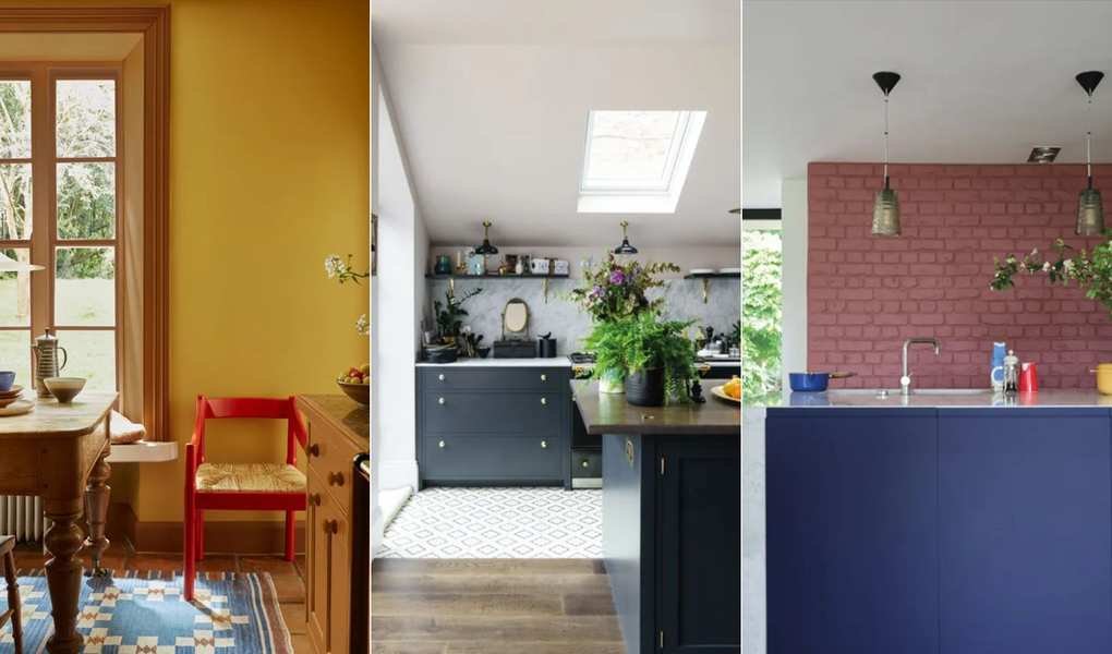
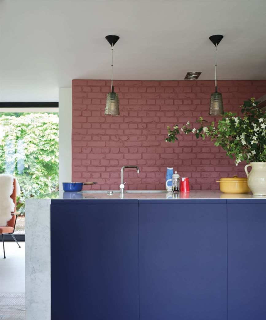
In a vibrant kitchen, Farrow & Ball's Titmouse Blue is featured on the island, contrasted beautifully with the muted Crimson Red on the walls.
Combine Light and Dark Tones in Kitchens
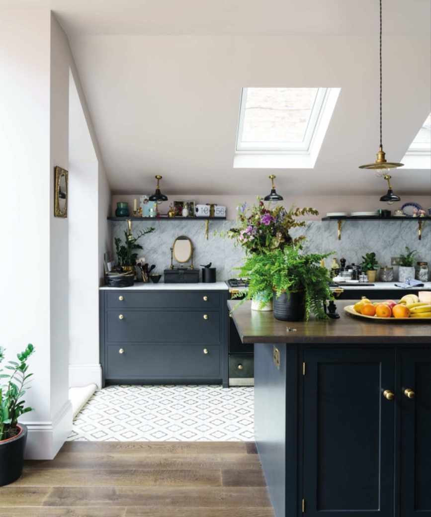
“We love mixing light and dark shades in kitchens,” says Patrick O'Donnell, a brand ambassador.
“Keep darker colors on lower cabinets, like Green Smoke, and pair it with a lighter shade like Shaded White for upper cabinets. Use the same color for walls to create continuity.”
For a central island, consider a contrasting accent color like Down Pipe, perhaps in a different finish for added glamour,” Patrick suggests.
Utilize the Color Wheel for Clashing Colors
“We enjoy using contrasting or complementary colors to bring harmony to a room,” says Rebecca Roberts, a designer. Bold colors can energize a space but should be balanced with equally strong elements.
“Common pairs include red and green, blue and orange, and yellow and purple. By adjusting tonal variations, you can achieve a unique balance. In a Manhattan penthouse, we utilized lively orange paired with warm blues, ensuring the space flows while showcasing bold colors,” Rebecca explains.
Achieve Subtle Contrast with Blue and White
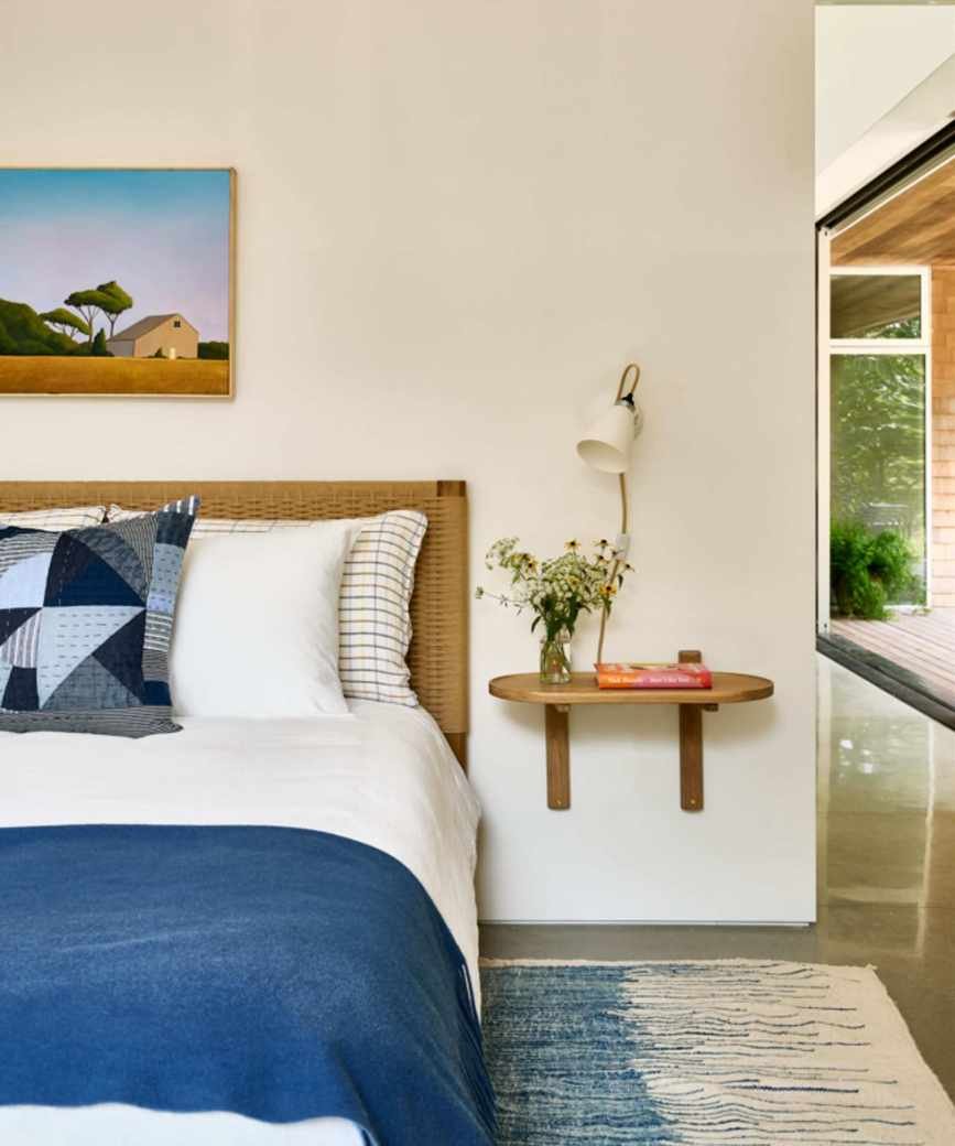
Creating contrast doesn’t require loud colors, as seen in a serene bedroom designed by Spruce Interior. The classic blue and white combination remains soothing while still delivering contrast through varying tones.
“This pairing is especially fitting for coastal homes,” says designer Susan Galvani. “The blend of blue and white creates a restful yet invigorating atmosphere due to the contrast.”
Add a Bright Accent to a Monochrome Scheme
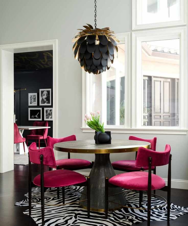
“Contrast highlights everything, from light to dark and bold against neutrals,” remarks designer Tineke Triggs.
“In this dining area, the vibrant fuchsia chairs steal the show, providing energy amidst soft gray walls and dark flooring. The playful zebra rug and black-and-gold pendant complete the look,” Tineke adds.
Brighten Spaces with Pink and Green
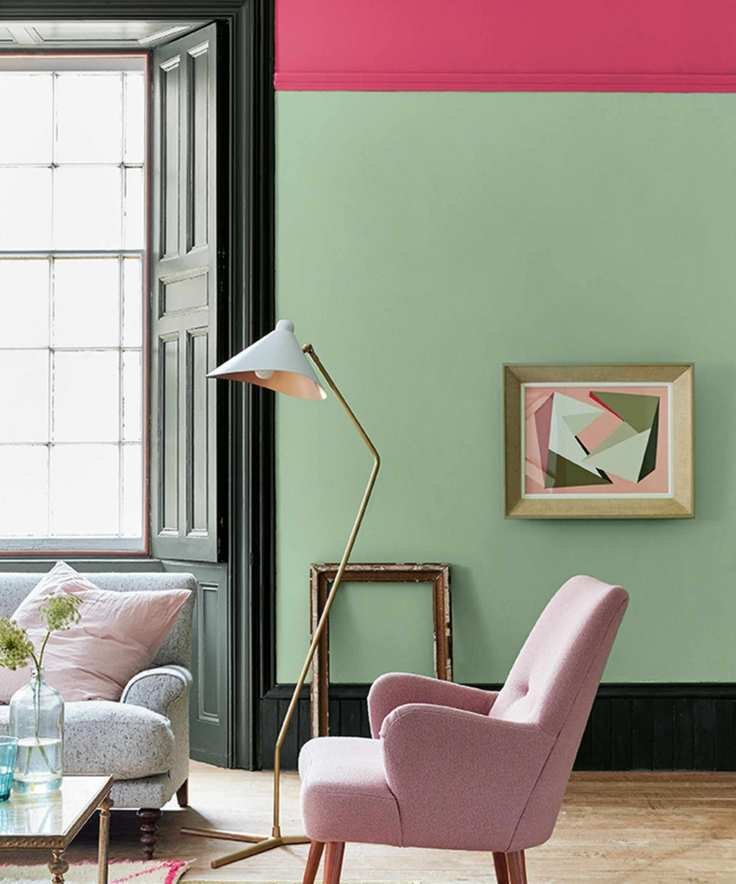
For a lively color scheme, pink and green create a delightful contrast, as illustrated in a cheerful living room.
“This combination reflects nature’s beauty, with pink and green working together like flowers and foliage,” explains Ruth Mottershead. “Opting for softer greens and light pinks offers tranquility, while bolder shades can provide a contemporary edge.”
Use Strong Colors as Accents
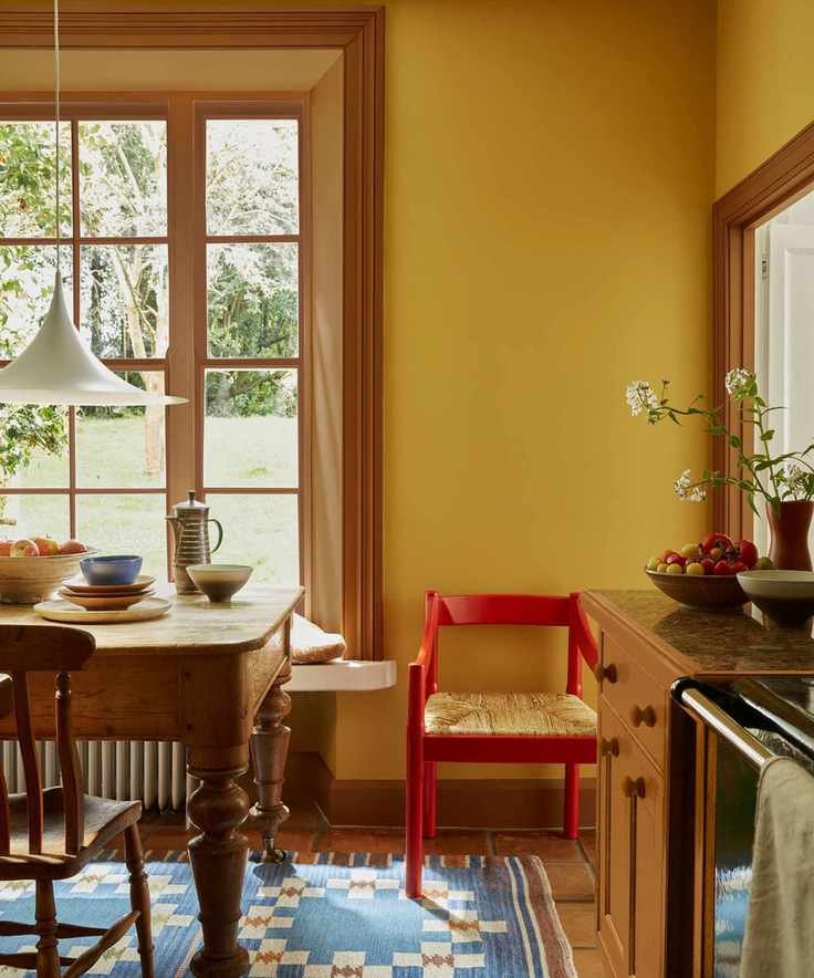
“If combining vibrant colors feels intimidating, try using a bold accent with a neutral background,” suggests Ruth Mottershead. In this kitchen, a bright red chair adds contrast without overwhelming the yellow scheme.
“This technique fosters a cohesive flow throughout your home by maintaining a consistent base neutral on walls and woodwork, while introducing diverse accent colors in each space,” Ruth advises.
Incorporating contrast into your color choices can greatly enhance depth, whether you take a subtle or bold approach. For those who love maximalism, clashing colors can bring drama, while blended dark and light tones in neutral rooms can create a balanced ambiance.


