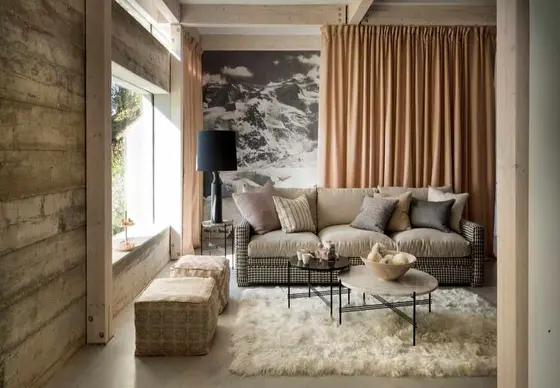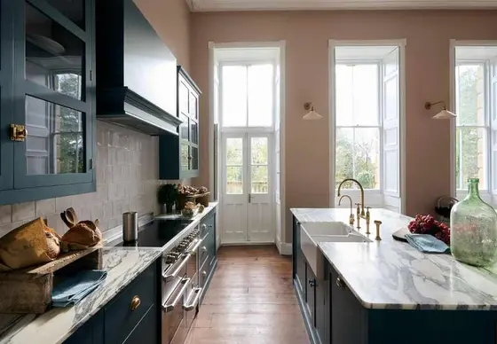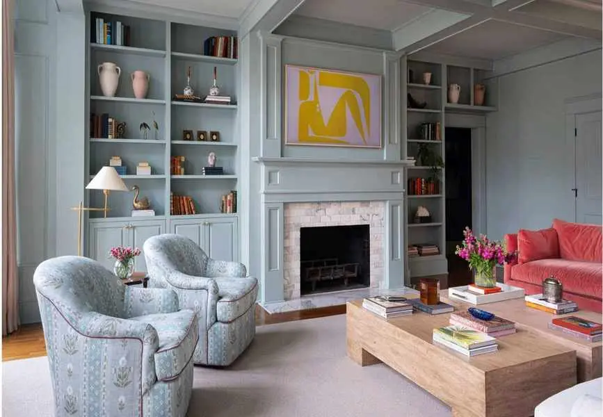
Creating a color palette for your living room is thrilling. As one of the most frequented spaces in a home, it offers a chance to express your unique style.
Yet, since the living room serves various purposes—from relaxation to entertaining—it can be tricky to nail the decor. To capture the right vibe, thoughtful planning is essential, especially given the myriad of inspirations available.
Not sure where to begin? Fear not! With insights from design professionals, this guide provides a roadmap for achieving your ideal living room. Whether you seek a calming retreat or vibrant accents, these stylish ideas will inspire you.
Selecting Your Living Room Color Scheme

Choosing a color scheme is a pivotal step in decorating. By breaking it down into five manageable steps, you can streamline the process. While there's no absolute right or wrong, understanding some basic principles will guide your creative journey. Familiarize yourself with current trends to spark inspiration.
Step 1 – Assess Your Space
Before diving into color choices, consider your existing features. The architecture, natural light, materials, and furnishings all play a role in determining the best palette.
Step 2 – Pick a Base Wall Color
Your primary wall color sets the overall mood. Determine what atmosphere you want: warm earthy tones provide comfort, while cool greens and blues offer calmness. A favorite fabric or artwork can also serve as inspiration.
Step 3 – Develop Your Color Palette
Designers often recommend limiting your palette to 3-5 colors. A color scheme that's too busy can overwhelm, while too few colors may feel flat. Choose complementary secondary and tertiary shades to enhance your base color. Applying the 60/30/10 rule can help maintain balance.
Step 4 – Incorporate Accents
Use accent colors in furniture, textiles, or art to add vibrancy. The color wheel is a fantastic tool for selecting complementary shades.
Step 5 – Add Texture
Texture and materials are vital in establishing mood. Consider how your chosen colors interact with selected fabrics and finishes. Warm textures can soften cool color schemes, while black elements can define neutrals. Don't forget paint finishes; matte or glossy can change the atmosphere dramatically.
Choosing Cohesive Living Room Colors
Selecting harmonious colors can be challenging, but understanding some foundational principles can simplify the task. Many designers start with the desired mood for the room, which guides their color choices.
Three effective palette strategies include monochromatic, where various tones of a single color are used; analogous, which combines adjacent colors on the wheel; and complementary, which pairs opposite colors for striking contrasts.
For a harmonious look, a monochromatic scheme often works best. Combine different shades of a focal color for subtle contrast. For example, mix light sky blue with deep navy and gray-blue.
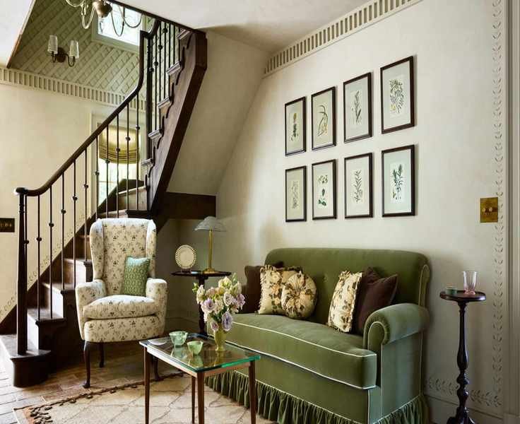
Analogous palettes create depth, like pairing greens and blues. Complementary schemes offer dynamic contrasts with colors like orange and blue. Playing with intensities between opposites can result in lively spaces.
Consider the Architecture
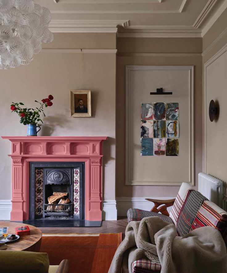
Ensure your color scheme harmonizes with architectural elements. Consider room size, features, and views to determine suitable palettes. The era of the property can also offer hints—modern, mid-century, or traditional styles demand different approaches.
Additionally, the room's orientation and the light it receives greatly influence how colors appear. North-facing rooms are cooler, while south-facing ones are warmer. East-facing rooms have bright morning light, while west-facing rooms enjoy warm evening tones.
Embrace Tonal Harmony

Instead of isolating your color choice, think in tones. Using similar colors across the space creates cohesion. Subtle variations in depth and temperature enhance the overall harmony.
Designers often favor tonal variations for a serene look. Soft blue tones across walls and furniture provide flexibility for bold color pops in accessories, ensuring a cohesive feel.
Utilize the Color Wheel

The color wheel is an excellent visual tool for identifying color relationships, helping you choose warm or cool palettes based on your needs.
Start with Key Furnishings

Often, the largest furniture pieces dictate color choices. Starting with a sofa or chairs can shape the entire room's personality. Alternatively, a patterned fabric can inspire your scheme, giving depth and character.
Try the 60/30/10 Method

The 60/30/10 rule is a reliable method for balancing a color scheme. Designate 60% for the dominant color (walls and major furniture), 30% for a secondary hue (window treatments, smaller furniture), and 10% for accents (throws, pillows).
Mind Your Undertones

For a harmonious scheme, choose colors that share similar undertones. Sticking to one temperature helps create a cohesive look. Mixing cool and warm tones can feel disjointed unless carefully executed.
Evaluate Color Saturation

Saturation affects a room's energy. Soft shades are soothing, while vibrant tones can energize a space. Bold colors can shine alone or be paired with equally powerful tones for a dramatic look.
Incorporate Bold Accents

When using tonal or monochromatic palettes, bold accents can add depth. Accent colors can be introduced through furniture or accessories to bring vibrancy to the overall scheme.
Selecting Colors Based on Room Size and Light
Consider room size and orientation when selecting colors. Lighting changes throughout the day, influencing how colors appear, so always test swatches in situ.
Best Colors for Large Spaces

In larger living rooms, warm colors create a cozy atmosphere. However, avoid oversaturation to maintain balance. Softer, nuanced tones are preferable to stark whites, allowing for a grounded, inviting feel.
Best Colors for Small Spaces

For small living rooms, neutrals can create a spacious feel, while deep hues can foster intimacy. Avoid stark whites; instead, opt for soft, light tones that enhance the sense of space.
Colors for North-Facing Rooms

North-facing rooms often benefit from warmer, lighter colors that counteract the cooler light. Look for hues with yellow undertones for a welcoming atmosphere.
Colors for South-Facing Rooms

For south-facing spaces, cooler shades balance the warm light. Deeper, muted tones work best to counteract the brightness.
Living Room Color Inspiration
For those seeking color palette inspiration, consider these timeless options that designers frequently recommend.
Classic Neutrals

Neutral tones remain a favorite, providing a warm base for layering textures and colors, especially in open-plan spaces.
Warm Earthy Tones

Warm, earthy colors offer comfort and grounding. Shades like taupe and chocolate are increasingly favored for their soothing qualities.
Nature-Inspired Schemes

Colors inspired by nature, like soft greens and natural textures, promote calmness and wellness.
Soothing Cool Tones

Soft blues create peaceful environments, ideal for relaxation. These tones pair well with natural materials.
Bold and Dramatic Colors

If you enjoy vibrant colors, a bold palette can create a joyful space. Balance is key to avoid chaos; consider using contrasting tones strategically.
Mistakes to Avoid in Living Room Color Design

1. Isolated Design Choices
Consider how your living room's color scheme interacts with the rest of your home. A cohesive flow enhances overall harmony.
2. Skipping Color Tests
Always test paint colors on your walls to see how they react to light at different times. Large samples are more effective than small swatches.
3. Playing Too Safe
While neutrals are safe and soothing, taking calculated risks can add excitement. A bold accent can elevate an otherwise flat palette.