

Interior Design
Choosing the right color combinations can be challenging but is a crucial part of home decor. Here, designers reveal their top color pairings that stand the test of time.
From vibrant hues to earthy shades, these combinations set the mood for various rooms and styles, whether you want a bold statement or a subtle touch.
Keep reading for fresh ideas to inspire your color choices in 2024.
Color Combinations for Rooms
We consulted design experts to gather their insights on effective color pairings. Utilizing a color wheel can guide your choices.
1. Green and Blue

Looking to blend green accents with blue designs? This duo offers a serene atmosphere.
"I adore the combination of blue and green, as seen in the artwork and textiles of this Miami living room," shares designer Natalia Miyar. "Both shades are soothing and create a refreshing, relaxed vibe together."
"This pairing captures the lush tropical essence of Miami. My love for nature fuels my inspiration; it reflects the region's beautiful surroundings and is quintessentially Miami."
2. Neutrals and Bold Colors

Neutral shades can also embrace boldness. But how to start?
“Select one color as your base—perhaps inspired by a favorite piece of art or clothing—and build around it with complementary shades,” advises Charlotte Archer, brand head at Sanderson.
“Always decorate for yourself; choose shades you love, and you'll succeed.”
3. Brown and White
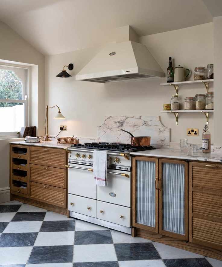
While 'brown living room ideas' might not sound appealing, this combination can be warm and inviting.
“I often return to the pairing of brown and white in various shades. Layering these tones creates depth and the feeling of a well-loved space,” shares Paolo Moschino from Paolo Moschino.
4. Yellow and Green

This year, experts are encouraging us to embrace vibrant colors, such as green and yellow in this Studio Duggan entryway.
“We’re moving away from last year's nostalgic tones to exciting colors that feel familiar,” says Joa Studholme, color curator at Farrow & Ball.
“The blend of India Yellow and Green Smoke symbolizes the optimism we need in our homes.”
5. Navy and Earthy Accents
Seeking a dramatic yet sophisticated look?
“When choosing paint colors, I lean towards moody shades like navy, gray, or noir. These darker tones add warmth and coziness. I then introduce natural accents like terracotta and stone,” notes Mikel Welch from Mikel Welch.
“Don’t hesitate to embrace darker tones, but remember to balance them with earthy shades.”
6. Earthy Naturals

Neutral shades provide numerous timeless color options, as demonstrated in this dining room by Studio Duggan.
“The size of your space influences how flexible you can be with color pairings: larger homes can handle broader palettes, while smaller spaces benefit from more cohesive colors,” advises Charu Gandhi from Elicyon.
“I love combining ivory, sunny yellows, and hints of navy, along with metal accents. Soft shades like rose pink and orange provide a calm yet luxurious feel.”
7. Blue and Red
For a timeless look, consider the pairing of red and blue.
“My favorite classic combination is denim blue with antique red. These hues create effortlessly stylish rooms that feel comfortable,” shares Ann Grafton, creative director at GP & J Baker.
You can adjust the intensity of this combo to suit your taste; vibrant reds with mid-toned blues create a striking effect, while softer shades lend a more tranquil atmosphere.
8. Green and Pink
Want a cheerful vibe year-round? Green and pink create a vibrant atmosphere reminiscent of blooming flowers in spring. Adding white keeps the look fresh.
9. Pastels with Strong Colors

Geraldine Tan's living room
Mixing pastel hues with bold colors can yield stunning results.
“I believe any color pairing can work; it just requires a neutral buffer,” states Dr. Geraldine Tan, creator of the interiors blog Little Big Bell.
“What might typically clash can harmonize if balanced by neutral shades, adding a calm touch to your decor.”
10. Blue with Vibrant Tones

“My favorite pairing is blue with any matching tone,” says interior designer Betsy Wentz.
“Blue is universally appealing and pairs well with rich greens, reds, and oranges, as well as pastels and neutrals.”
In her dining room, Betsy uses various shades of blue across chairs and curtains, layering in other vibrant hues for a lively atmosphere.
11. Red and Pink

Red and pink create a striking duo for designer Matthew Williamson, who favors plaster pink as a backdrop with red accents for a stylish touch.
“In fashion, I used red generously, but in interiors, I prefer it as an accent,” Matthew explains. “Using it sparingly highlights key pieces against a soft background.”
“I enjoy soft pinks as a new neutral; combining them with red offers a delightful contrast. For those hesitant to mix these colors, start small—like with a bouquet of red flowers in a pink vase. A touch of red can dramatically enhance your space.”
Countless color combinations can work beautifully together, but natural and soothing tones remain timeless.
“Perhaps I'm biased since I have this in my own home, but sage green paired with off-white is so elegant and calming,” notes interior designer Kathy Kuo. “Sage green adds a subtle yet colorful statement, evoking nature's beauty.”
Joa Studholme from Farrow & Ball suggests that blue tones also provide a calm color palette that remains in vogue: “Soft shades of blue remind us of childhood memories, offering a soothing ambiance in our homes.”


