
The 80-20 color rule is one of the simplest design principles to adopt, and when applied correctly, it can dramatically change the ambiance of your living space.
Implementing the 80-20 color rule is straightforward. It suggests that 80% of your room should be adorned in neutral shades like whites, creams, beiges, or soft pastels. The remaining 20% is your opportunity to express creativity with bold colors and patterns. By following this guideline, you can achieve a well-balanced interior.
'The 80-20 color rule is fantastic for room color schemes because it strikes a balance between neutral and accent shades, resulting in a cohesive and visually appealing environment. The neutral tones create a solid base, while the accent colors introduce excitement and depth,' shares Artem Kropovinsky, an interior designer and founder of Arsight.
Understanding the 80-20 Color Rule and Its Application
This design principle is a vital tip for interior designers, indicating that 80% of the color palette in a room should consist of neutral hues.
However, when working with neutral colors, excessive splashes of color can feel overwhelming unless carefully planned. Fortunately, the 80-20 rule helps ensure that by limiting bold colors to just 20% of the room, you can achieve an ideal color balance. It also allows for the incorporation of current color trends without going overboard.

Based in New York, Artem Kropovinsky, the founder of Arsight, boasts over a decade of extensive design experience worldwide. Emphasizing minimalism, sustainability, and authenticity, Artem and his team tackle projects across the US and beyond. Here, he outlines how to effectively use the 80-20 rule in various rooms of your home.
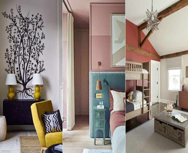
- Living room: 80% neutral walls complemented by 20% accent cushions and throws in a striking color.
- Bedroom: 80% neutral bedding paired with a 20% calming accent wall.
- Kitchen: 80% neutral cabinetry with 20% accent tiles or countertops featuring a bold hue.
- Bathroom: 80% neutral tiles with 20% accent towels or a shower curtain in a contrasting color.
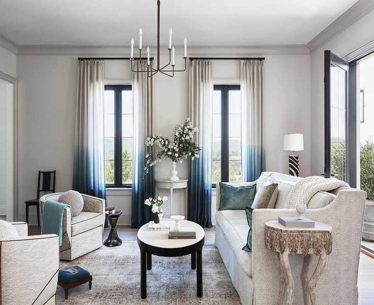
'For me, the 80% typically includes larger investment pieces like sofas or area rugs, as well as paint or wall coverings,' notes Ariella Duker, founder of Ariella Duker Interiors. 'The 20% introduces drama, contrast, and visual interest, which can come from window treatments, decorative pillows, accessories, or a standout piece of furniture, as well as art displays.
Why the 80-20 Color Rule Works So Well

Ariella Duker, a former fashion stylist and Sotheby's-trained art historian, has translated her extensive experience into interior design. Her background in art history gives her a profound understanding of classic design principles, infusing a timeless quality into contemporary spaces. Many of her projects feature a tonal, neutral palette, accented with thoughtfully chosen colors that add character to the environment. A recipient of the IFDA Rising Star award, she has also been recognized on Luxe Magazine's Gold List.
The 80-20 color rule is effective because it fosters a cohesive design, and it encourages you to explore accent colors in a neutral setting.
Similar to the 60-30-10 rule, it provides a framework that helps prevent overwhelming a space while ensuring a polished aesthetic for your home.
'While some may argue you can't have


